What Logo Size is Best: The Best Logo Sizes for Different Platforms
It’s always a good idea to use a consistent logo across your entire online presence, including your website, social media profiles, and online directories. A clean, well-designed logo will help boost your brand recognition, ultimately making your overall marketing strategy more effective.
While using one logo is the way to go, you’ll likely need variations of it in all different shapes and sizes. That’s because every platform that makes up your online presence has slightly different logo size requirements.
Why Logo Size Matters
When it comes to your logo, size matters because you want your brand to show up in a clear and recognizable way. That means your logo must display at the best possible quality for any given platform.
For a logo to look great across all platforms, it must be optimized to each one individually. You want to use the right pixel dimensions to achieve maximum quality and an optimal file size.
A website header is obviously going to need a different pixel size than a favicon, for example. But beyond that, your ideal website logo size will vary depending on which platform is hosting your site.
Best Logo Sizes for Different Platforms
![]()
The ideal logo size is really on a platform-by-platform basis. Depending on which platforms you use, you’ll want to get familiar with the logo variations you’re going to need so you can show up online in the best possible way. Depending on the platform, you might choose between either a vertical, horizontal, or favicon (icon without text) variation.
Website Header
Your website header logo will most likely appear in the upper left corner of your browser window. Sometimes, you’ll see a site logo displayed in the top center of the page. These images are normally small and rectangular.
Website logo sizes vary based on platform requirements. Depending on which framework you’re building on, you’ll want to find out the exact dimensions for your site logo. Generally speaking, a good baseline logo size is 250 x 100 pixels.
Other possible website logo size variations include:
- 250 x 150 pixels
- 350 x 75 pixels
- 400 x 100 pixels
- 160 x 160 pixels (square for vertical layouts)
If you want a full header for your website rather than a small logo, you’ll need an image optimized at 1024 x 768 pixels.
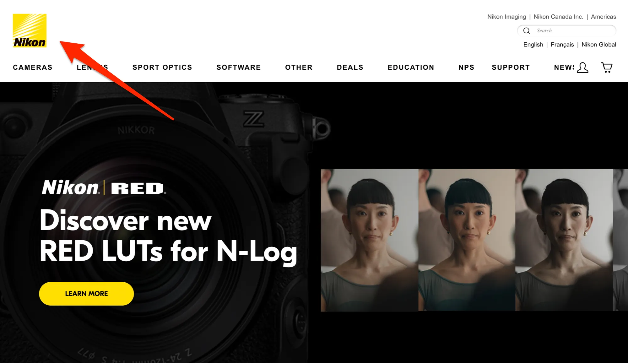
Take a look at the following site logo example. Nikon’s website displays a small, square logo in the top left corner of the page. Notice how the image is simple, recognizable, and easy to read.
Favicon
A favicon is a small logo that appears in your browser tab to identify the specific website you’re visiting. These images are usually a scaled-down version of your logo. It can also be a derivative variation of your logo that’s still recognizable within your visual branding.
You’ll often see favicons on your favorite branded websites. Here’s an example: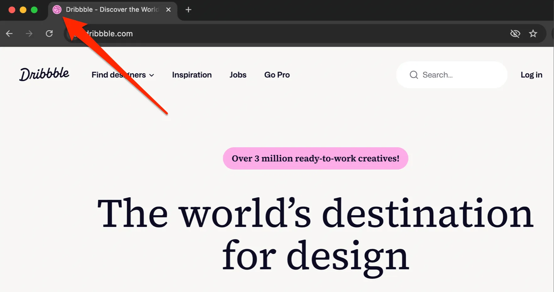
When you create a favicon, you’ll want to use a small, square image. While you’ll commonly see favicons coming in at 16 x 16 pixels, other square dimensions will work, such as 32 x 32 pixels or 48 x 48 pixels.
Social Media
Social media logo icons vary from one platform to another. Let’s take a look at the dimensions you’ll need for your logo size across platforms.
- Facebook: 196 x 196 pixels (both Pages and personal profiles)
- Instagram: 320 x 320 pixels
- X (Twitter): 400 x 400 pixels
- YouTube: 800 x 800 pixels
- TikTok: 200 x 200 pixels
- Tumblr: 128 x 128 pixels
- Pinterest: 165 x 165 pixels
- LinkedIn: 400 x 400 pixels
- Quora: 200 x 200 pixels
Email Signatures
When it comes to your email signature, size recommendations vary. The best logo size depends on your email platform and how the image will display for end-users.
You’ll likely want to keep your email signature size small but readable, similar to a website logo. Square versus rectangular images will depend on your personal preference, the email platform you use, and how it displays images.
A good starting point would be an image with a 150 to 300 pixel width, and you can adjust the size and dimensions based on your preferences.
To learn how to make a custom email signature the easy way, watch our full video walkthrough:
5 Logo Design Tips & Tricks
If you’re looking to design a professional branded logo for your online presence, there are some best practices and guidelines to follow. Let’s take a look at a few tips and tricks you can use to create a strong logo.
1. Create a unique, distinct logo that will look great, large or small
Creating a strong logo means you’ll need to consider how it will look at scale—large or small. If you shrink your logo for a social media platform or even a favicon, will it be recognizable? Will your users know what they’re looking at? Will they be able to recognize your logo or read it where needed?
2. Follow your brand style guide
When it comes to your logo, be sure to follow your brand style guide. Keep your colors and font consistent with your selected brand style (such as the colors you use on your website and in your marketing materials). This ensures your logo remains recognizable across your online presence and represents your brand well.
3. Use the correct logo size for each platform
Using the correct logo size for each platform ensures that your logo will always look its best. Easy design tools like Snappa can help you resize and optimize your logo images for different platforms.
4. Include variations of your logo, both with and without text
Including logo variations with and without text means you’ll have options when it comes to displaying your logo across platforms. You can have a text-only version of your logo and a branded image icon to go with it.
You can use these logo variations interchangeably. For example, a design without text can be used as a favicon so it’s recognizable at a glance—since favicons are too small for site visitors to read.
5. Test logo variations
Test out different variations of your logo, including inverse colors, to see what works best for your brand. You may need to experiment with varying combinations of color and contrast, and whether or not to include your wordmark. In the end, you want an eye-catching design your followers will remember.
Another useful idea is to create a black, white, and full-color version of your logo. These variations will come in handy more than you might realize! If it’s a strong logo, it will look excellent in all three variations. Here’s our Snappa logo in all three styles:
![]()
Logo Examples from Snappa
Looking to make a quick and simple logo for your brand? Snappa’s profile picture templates are incredibly versatile and can give you color scheme ideas to help you make a sharp logo, watermark, or favicon.
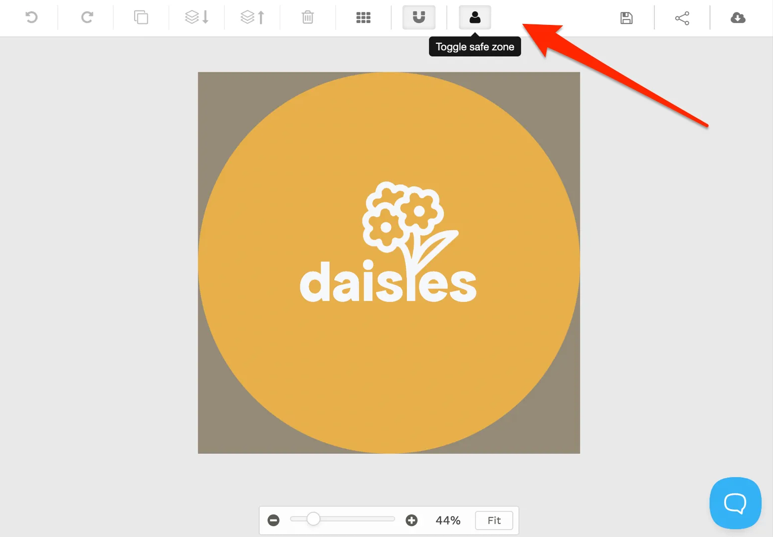
In Snappa, you can toggle the safe zone to see how your design will appear as a round logo, to account for those platforms that crop it to a circular image:
Here are some of our favorite logo templates from Snappa. Use them for inspiration, customize them to your liking, and bring your ideas to life:
Marketing Agency Logo Example

Environmental Logo Example

Blog Logo Example

Tech Logo Example

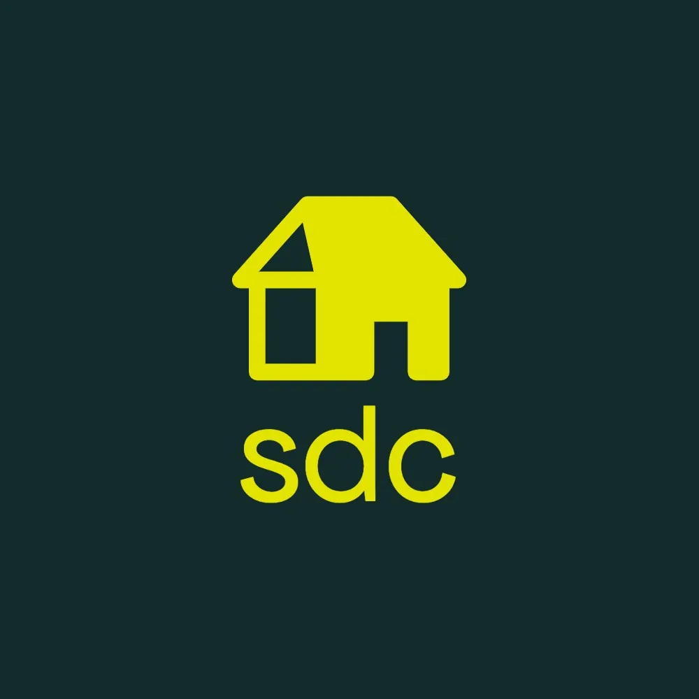
Real Estate Logo Example
Luxury Logo Example

Final Thoughts
Creating a unique and eye-catching logo design that works well for your brand and your followers takes thought, creativity, and strategy. Once you have a great logo, you’ll need to scale it down to the best logo sizes for all platforms. Then you’ll be ready to represent your brand across your online presence.
If you need help creating a strong brand logo and optimizing its size for the platforms you’re using, try Snappa. You can get started for free here.