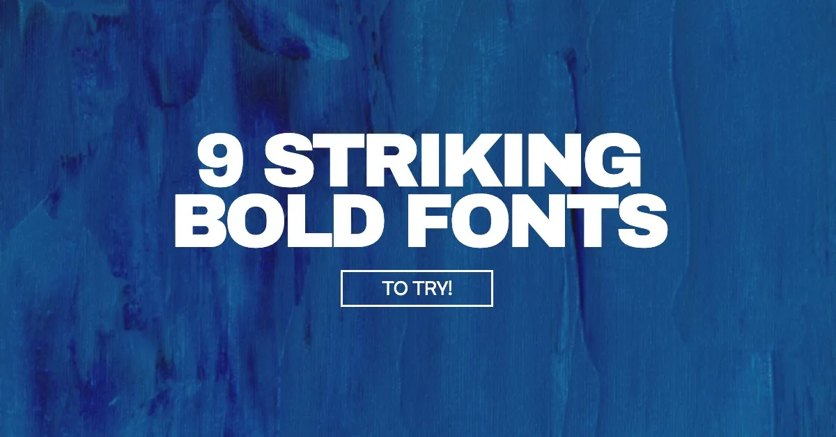
9 Striking Bold Fonts to Try Today
Whether you’re trying to emphasize certain words, create hierarchy in your designs, or make easy-to-read titles for your IG posts, bold fonts are your new secret weapon! Having a range of text styles in your design will create a more engaging visual experience. A bold font is just that, a simple but powerful way to create a dynamic design.
Thankfully, our software has some incredible bold font options to choose from. So we’ve curated 9 bold fonts for you to try on any project today! These are all free to use, and perfect in any use-case, whether being used for a logo, blog heading, or web page.
So let’s jump right in!
9 Striking Bold Fonts to Try for Free
1. Archivo Black
First up, we have what is arguably a staple. Archivo Black is a clean, crisp choice for any heading or title. Perfectly legible for small screens (ie. Instagram posts, Twitter profile pics). This bold sans serif is commanding and blends with the other elements in the design flawlessly. Use it in all capitals, and you’ll have a strong impactful design.
It also works perfectly for display ads as seen below. The bold clear type over the image has great legibility even if seen on a tiny display ad on the side of your browser.

2. Bolden
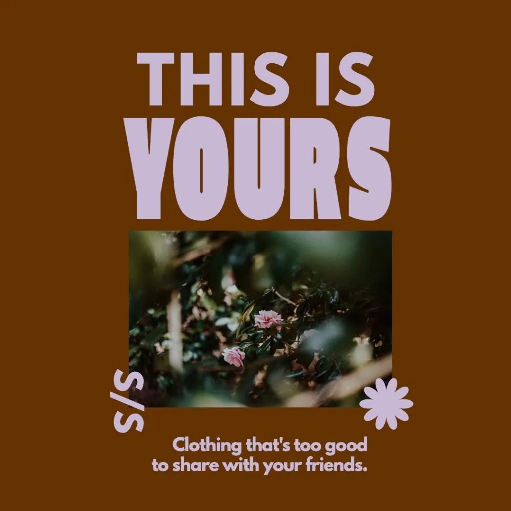
Next up we have the typeface called Bolden, a name that truly says it all. If you’re looking to bolden up your text, use this font for a title. Notice here how well it pairs with the muted lavender color tone.
One thing to note with this font: it is less legible than others, so its perfect to use sparingly on one or two words, but we woudln’t recommend its use for a full tagline. Use it to emphasize a single word, like in the graphic above. Think short words, titles or watermarks.
3. Anton
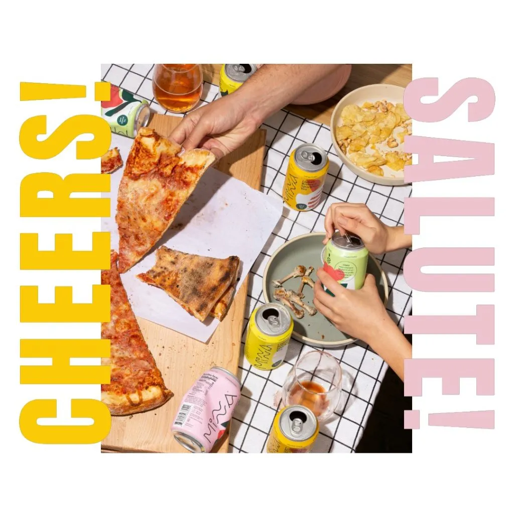
Anton is a favorite over here at Snappa. It’s easily recognizable by its condensed height. Try it with a wide letter spacing, and it’ll fill out the edges of your design nicely.
We love how it looks in the template above with the pink and yellow palette.
Expert tip: Why not colorize your text with colors found in your product image? Notice in the example above how incorporating the pinks and yellows from the images of cans creates a cohesive look and a smooth flow!
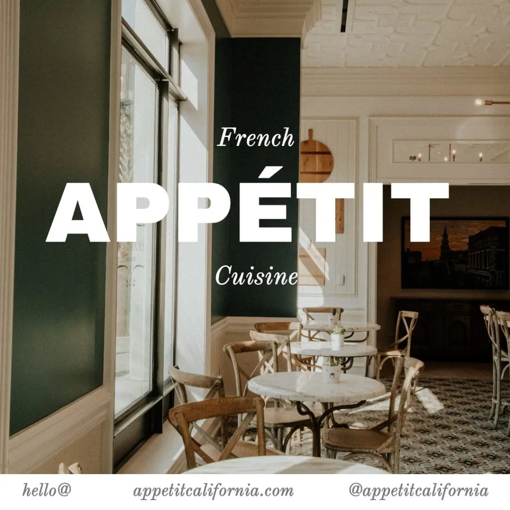
4. Cooper Hewitt Heavy
Cooper Hewitt is a charming typeface that comes in different variations. Originally created as a custom font for an art museum, it’s now publicly available and free to use for all of us! Seen here in the heavy variation, this font is a great choice for display ad titles and copy.
Give your graphic a billboard-like vibe with your slogan nice and bold at the top of the canvas.
5. Aileron Heavy
Aileron is another cool sans serif that makes for the perfect free Helvetica alternative. It’s great in many different sizes, and looks especially-uniform when used for a title and copy at the same time.
For fun, you might even want to pair Aileron heavy with its regular and thin variations to make some really cool designs!
6. League Spartan
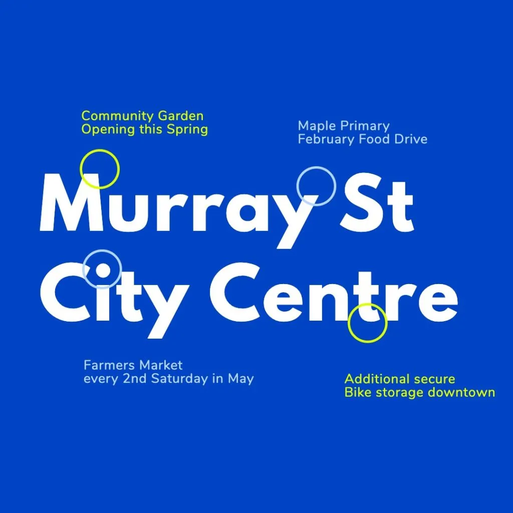
League Spartan is a great interpretation of a 20th century sans serif font. Its timeless shape makes it versatile for all types of design styles. Seen here in a map-like infographic style, this font offers an easy-to-read classic aesthetic.
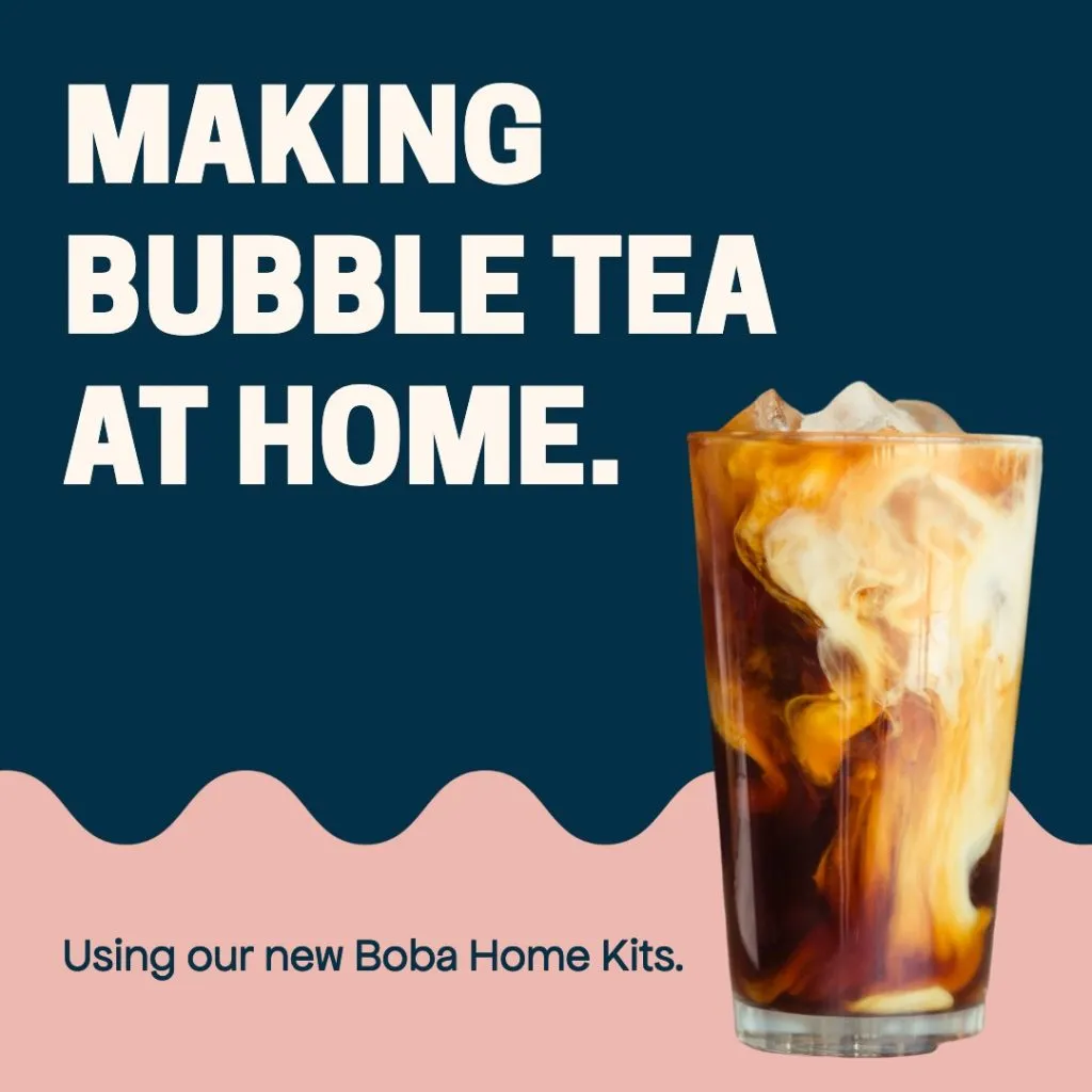
7. Rubik One

We love Rubik One’s subtle round edges. The roundedness gives it a fun and family-friendly feel. Use it for your summer camps, bubble tea menu’s, and any other graphic that you want to come across as family-friendly, all whilst giving a professional touch.
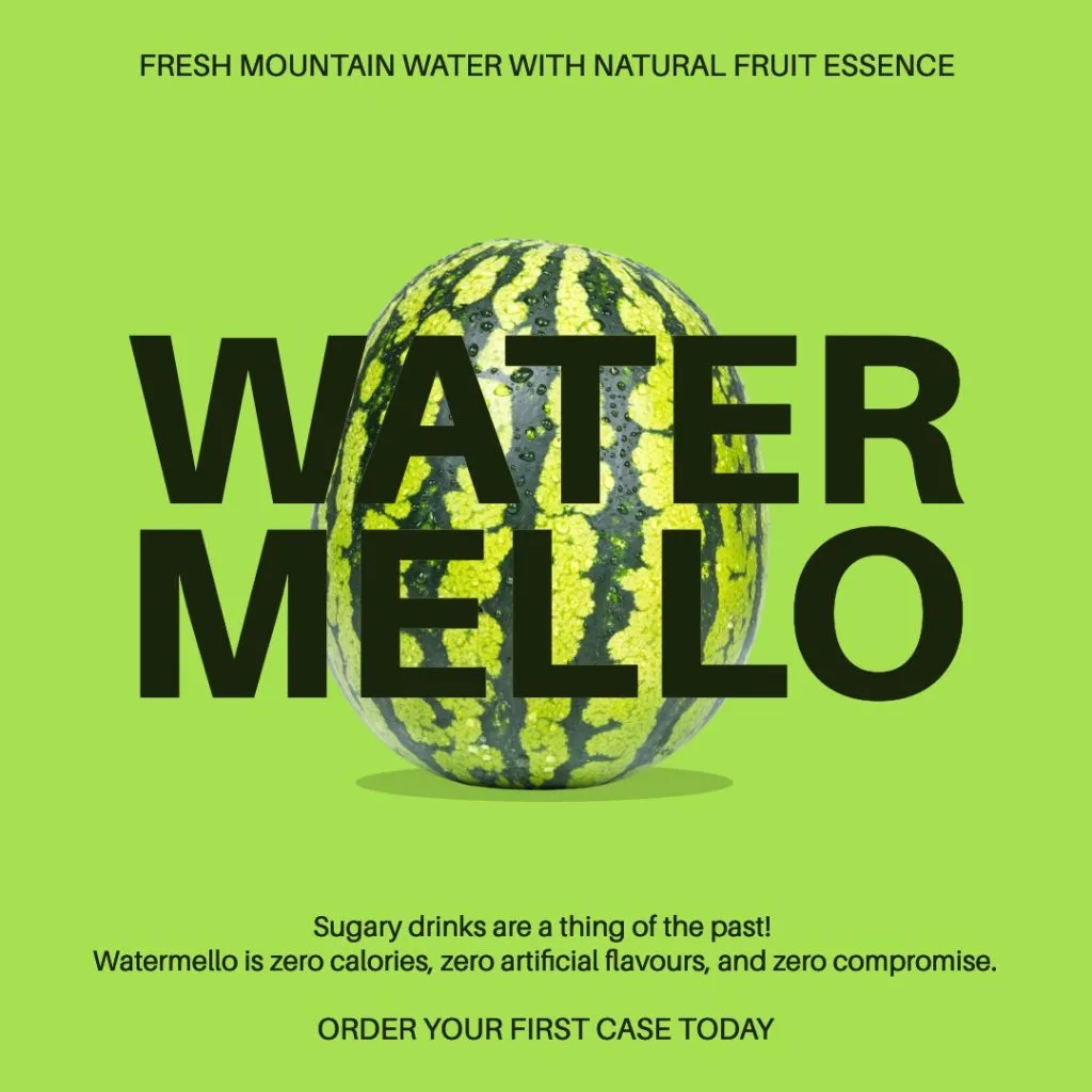
8. Archivo Narrow Bold

Another form of Archivo that gets a lot of use around here is Archivo Narrow Bold. Using a condensed sans serif font like this one is another show-stopper. Much like its sibling Archivo, it’s the perfect font for basically anything! Notice how it stays readable in the yellow shade here. Sometimes, when white text doesn’t read well over a brighter image, a nice shade of yellow will make all the difference! This is color contrast at its finest.
9. Lato Heavy

Lastly, we have Lato Heavy. It’s thick and wide, and looks stunning with short four to five letter words. Use it for your book club, swim club—heck—any club!
The gentle pink and blue color palette in this template is a bonus! It’s soft on the eye, but has enough contrast that your eyes are immediately drawn to read the text. This template is another prime example of design that doesn’t need an image to represent its content.
Final Thoughts
As you can see, there’s no right or wrong way to use these bold fonts. When you’re looking to highlight certain words, create hierarchy, or just add some depth to your graphic, these bold fonts will do the job! If any of these typefaces we’ve covered jump out at you, don’t forget you can click on any of these images to try them for FREE in Snappa!
Bold fonts are a perfect way to grab the attention of your viewer, especially when your content has to be viewed on small screens, and devices. Now you should have a wide arsenal of fonts to use in your tool-belt. Gone are the days of hard-to-read text. These bold font variations will add dynamic and depth to your Instagram posts (or all posts for that matter!) in an instant.
Ready to make your own Instagram posts for free? Get started with Snappa here. What do you think? Are there any other bold fonts you would have included? Let us know in the comments below!
