The Ultimate Guide To Form Design

Have you ever booked an appointment, scheduled a call, added items to your shopping cart, and registered for Spotify or Netflix?
Then you’re familiar with online forms. And you know you need them to carry out all these and similar actions.
That said, online forms have been in existence for about as long as the internet. And without being aware of it, internet users became dependent on them.
Want to design better online forms? Then this guide is for you. We’ll walk you through as you design beautiful forms that get the job done.
Understanding Forms Psychology
People use online forms practically every day. And in concept, online forms seem simple enough. But if you dig deeper and closely into the science behind online forms, you’ll know the truth: designing effective forms is not a simple task.
If trust is part of the picture, promising things can happen. You could say the same about how people will want to fill out and complete forms if they find a brand trustworthy.
So as you design your forms, be attentive to the level of trust you can establish with respondents. How will their mind react when they stumble upon your form?
Once you can understand the different psychological factors that come into play, that’s your cue. That’s when you can encourage people to respond to your form in an open manner.
Here are other relevant discussions:
-
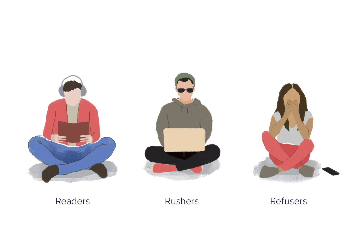
Think like the respondents - Readers (or people who read forms carefully), rushers (or people who want to fill out forms as quickly as possible), and refusers (or people who don’t want to fill out your form) are the categories of people that answer forms. Your goal is to accommodate all these people and reduce the number of refusers.
-
Be strategic with form length - The more form fields you add, the more cognitive friction you bring to your form. This can decrease the form completion rate by as much as 23.93%. So unless a form field is required, don’t place it on your form.
-
“Timing is everything” - It’s ideal to introduce your brand at the beginning. Remember to ask only general information about your respondents first and then gently earn their confidence before you throw in personal questions.
Source: Paperform
Structure Your Forms Well
How you structure your online form is really up to you. There’s no rigid rulebook or step-by-step guide to approaching this.
But there are factors that affect the outcome. And the most significant ones are how you empathize with your respondents and what your desired results are.
If you create a form that puts light on these factors, the form creation process can help you achieve better results.
Here are other relevant discussions:
-
Group your content - Long forms tend to be confusing. But you can eliminate confusion and subconsciously encourage form completion by organizing them — splitting and then categorizing each element.
-
Provide clarity - This is especially true if you’re giving out instructions. Be straightforward and understandable.
-
Use the right words - Stick to the sentiment your form is trying to suggest. Don’t use negative, pushy, and demanding terms.
Designing Beautiful Forms
Piles of research (including research spearheaded by the neuroscientist Antonio Damasio) can support how emotions drive the decision-making process.
And we don’t mean to be dramatic, but unattractive web design is the bane of many people’s existence. Notably, the most common factors that contribute to a form’s unattractiveness are terribly aligned fonts, invisible navigation, absence of icons, and crammed text.
So when people encounter an unattractive online form, you can understand why they get frustrated. And because they don’t feel positive about it, they have zero intentions of filling it out.
Here are other relevant discussions:
-
Use contrasting colors - Refer to an RGB color wheel, for example. This will help you choose color combinations that go well together.
-
Apply a relevant theme - Avoid generic themes. Instead, go with a theme that reflects your brand’s colors, messaging, and personality.
-
Compel with visuals - Use images and videos to strengthen your points. And be consistent with their sizes, styles, and opacity.
5 Best Online Form Examples
Let’s look at five online forms. Of the millions of forms out there, they’re among the best. And we’ll let you know why.
We’ll also share which company made them and the features that make them so effective.
Paperform
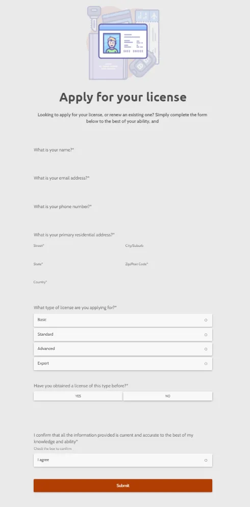
There’s beauty in simplicity. And Paperform, a company that helps people create beautiful online forms, knows that.
Because of its presence in the form-creation industry, it’s understandable why it has a sea of online forms templates on its website. Of the many designs that rock, its form that assists driver’s license applications is impressive.
Other features of the form that make it effective:
-
Asks for relevant details - Compared to two-field processes and other basic online forms, it requires more information. But this doesn’t delay the application process in any way. After all, it doesn’t ask for more information than what’s necessary.
-
Simple and elegant - Its interface is clean and doesn’t distract from the web copy. At the same, it doesn’t give off a bland vibe.
-
Fun design - Although it’s an essential process, applying for a driver’s license is a boring task. And thanks to Paperform’s touch of adding a bit of quirkiness to something that precedes it, the chances of people completing the process are higher.
Softr
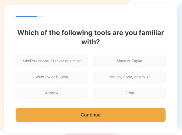
Softr, a professional no-code web app builder, has a praiseworthy multi-step online form slash client onboarding process. Because its form is well-designed, of course, first-time Softr users will want to fill it out.
One of its striking aspects? Its visual content — color sets, typography, and white space — is designed strategically.
Other features of the form that make it effective:
-
Progress bar - It helps to know where people are in the form-filling process and how long they still have to go. Not everyone enjoys filling out multi-step forms, but most people will complete them if it provides a sense of transparency.
-
Clickable and descriptive options - Softr’s form isn’t difficult to complete. Not only do the options or answers take a millisecond to click, but they’re also rich in information.
-
Explainer video upon completion - Softr neatly wraps up their client onboarding process. And this is because of an explainer video that serves as a greeting as soon as clients want to start using the company’s product already.
Referral Rock
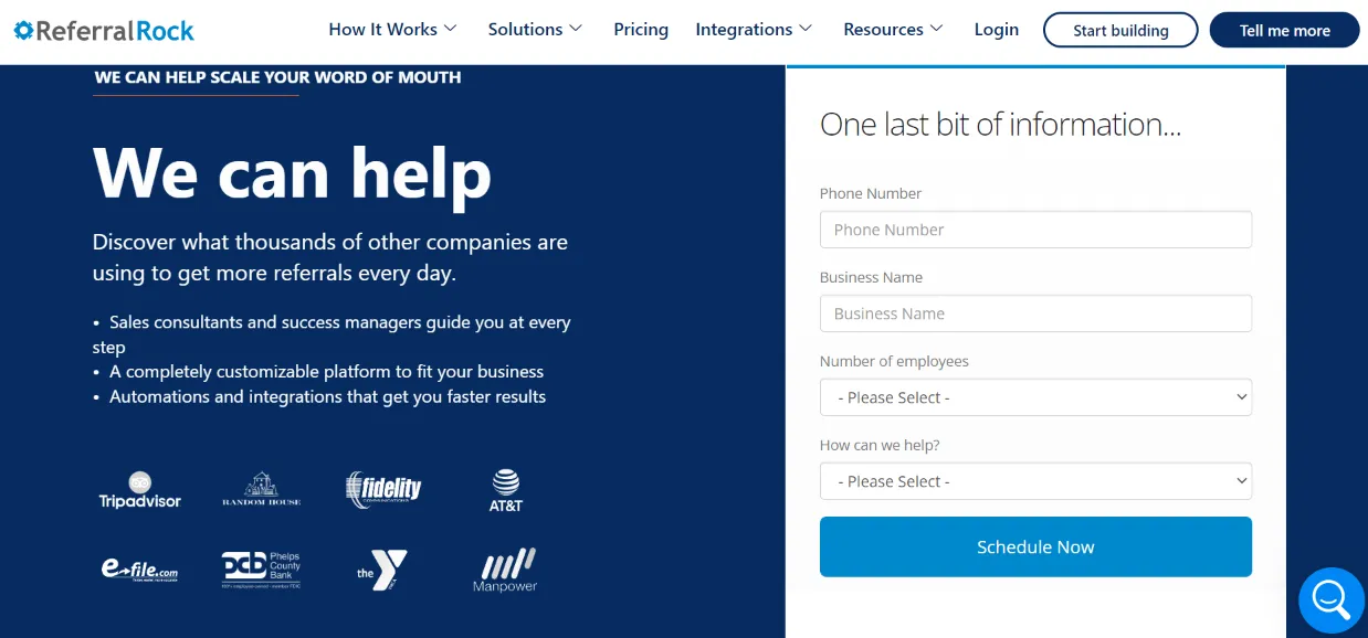
The client onboarding process of Referral Rock, a company that developed marketing referral software for all kinds of businesses worldwide, is worth checking out. The process leads to an online event scheduling app.
For making the onboarding and then scheduling processes so effortlessly, the company deserves a thumbs up. Once you fill out the online form’sn details and then confirm them by clicking the Schedule Event button, you’ll be taken to a page where you can receive information about your scheduled event (or meeting with one of Referral Rock’s representatives).
Other features of the form that make it effective:
-
Exceptional User Experience (UX) - The scheduling form has a minimal design. This gives off a positive UX because it doesn’t feature any distracting elements.
-
Excellent color choices - The colors blend perfectly. And it doesn’t feature anything but the brand’s colors. It’s also partly because of this that the path to scheduling isn’t confusing.
-
Lays out the form’s purpose - The web copy is clear and brief. And in addition to describing the purpose of the online form, it asks for nothing but required information.
Website Planet
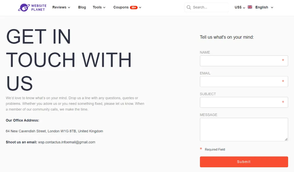
Website Planet, a content provider that shares valuable information of sorts about building websites, has a straightforward contact form. People go to a site’s contact page to contact the webmaster — plain and simple. And Website Planet conveys this message clearly.
True — most websites have contact forms. What makes its form a cut above the rest is its simple yet outstanding design. Its contact form is a testament to what it does: provide valuable information.
Other features of the form that make it effective:
-
Coherent design that helps carry out the page‘s purpose - From one perspective, you could say it gives off an average UX and has an ordinary design. And from another perspective, it’s hard not to see how its basic design matches the vibe that the brand gives off.
-
Supported by informative copy - It combines the form with a clean web copy that includes Website Planet’s office and email addresses. And without a doubt, it gets the message across.
-
Specifies required user information - Fields marked with an asterisk serve as instructions. They spare people from wondering why their submissions wouldn’t go through.
User Guiding
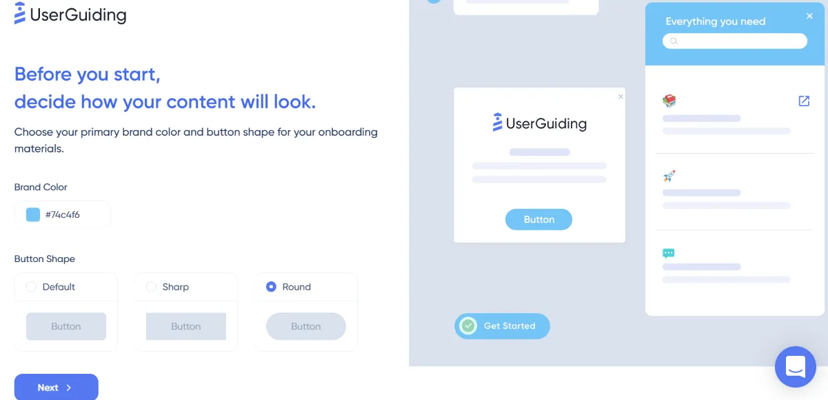
User Guiding is a software for creating beautiful user-walkthroughs and product onboarding.
The process of creating a product walkthrough with is easy as 1, 2, 3. And this has a lot to do with how the company provides descriptive instructions every step of the journey.
If you make a mistake along the way, no need to panic. A pop-up will appear to help you out. Take the pop-up below, for example.
As the image above reflects, it shows empathy to users who make mistakes or forget a step during the onboarding process. Not only does User Guiding provide a relevant checklist, but it also calls the user’s attention to their mistakes.
Other features of the form that make it effective:
-
Clickable options and modifications - Users can easily choose an option. It also acknowledges that creating product walkthroughs is a process, and it’s not a one-and-done deal.
-
Accommodates first-time product walkthrough creators - Creating product walkthroughs may overwhelm beginners. So in case they forget some steps, they can effortlessly access a checklist and get notifications about any errors.
-
Visually pleasing - As mentioned earlier, people dislike unattractive web design — and User Guiding took that into account. It has amazing color choices, its theme is relevant to the brand, it uses simple and concise words, and more.
Conclusion
It’s true — you and your team have control over form design. But how people react and respond to your online form is another story.
Here’s a practical way to approach this: A/B test your form. Create two variations of it to present to a target audience. Then analyze the results to see which variation attracts more people.
