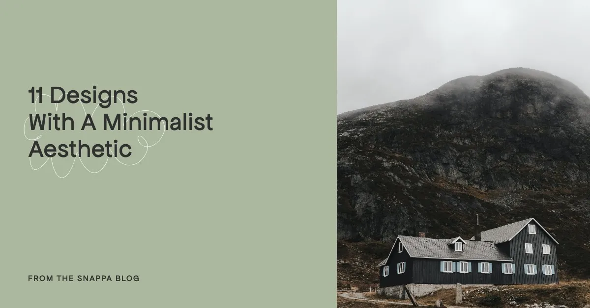
11 Designs With a Minimalist Aesthetic
Whether you’re scoping out some design trends on Instagram, TikTok or Pinterest, chances are, you’ve come across that minimalist aesthetic. Popular design accounts everywhere are posting crisp modernist sans serif fonts, clean solid color backgrounds, and those super cool minimalist layouts that utilize plenty of negative space.
Famed designer Dieter Rams once said that “good design is as little design as possible,” and this is couldn’t be a more perfect summary of minimalist modern design! Generally speaking, the less the elements the better. Most design schools even make their students do exercises where they will strip down a graphic to only the absolute necessity of elements. Because, the argument suggests, every single element should have a purpose.
Thankfully, you don’t need to be a graphic designer to enjoy minimalism in design. With our software Snappa, we have literally thousands of templates that incorporate modern clean design, thanks to our expert design team! So what better time than now to curate some design that embodies that aesthetic.
So without any further delay, here are 11 designs with a minimalist aesthetic that will suit virtually any type of business!
1. Minimalist Facebook Post
It’s no surprise that a minimal design will thrive in an other-wise cluttered Facebook feed. Can’t you just picture the chaos of your Facebook feed? Posts of all kinds, images covered in blurry text, videos autoplaying nonstop. Posting your clean minimalist design will be a breath of fresh air for your Facebook friends. Guaranteed, it’ll be a sight for sore eyes!
So how do you make a graphic that breathes? We recommend using a ton of negative space/whitespace, widely-spacing your text, and creating thick margins! But hey don’t stress, just click on this template itself to make it your own!
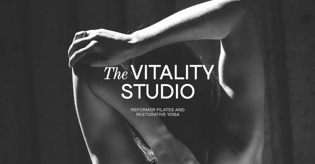
2. Minimalist Instagram Post
Next up, we have the world of Instagram. Whether you’re creating an Instagram post like this one, a Reel thumbnail or a Story, you’ll want a striking design without having too much going on.
Notice how the perfectly left-aligned text creates a strong commanding visual tone? The modern sans serif font creates a strong modernist mood, but the warm fall color tones and smiley emoji make sure the graphic isn’t sterile or overly serious. As you can see, great design doesn’t always rely on images! It also proves that using one sole font for a graphic is a great way to keep uniformity.
3. Minimalist YouTube Banner
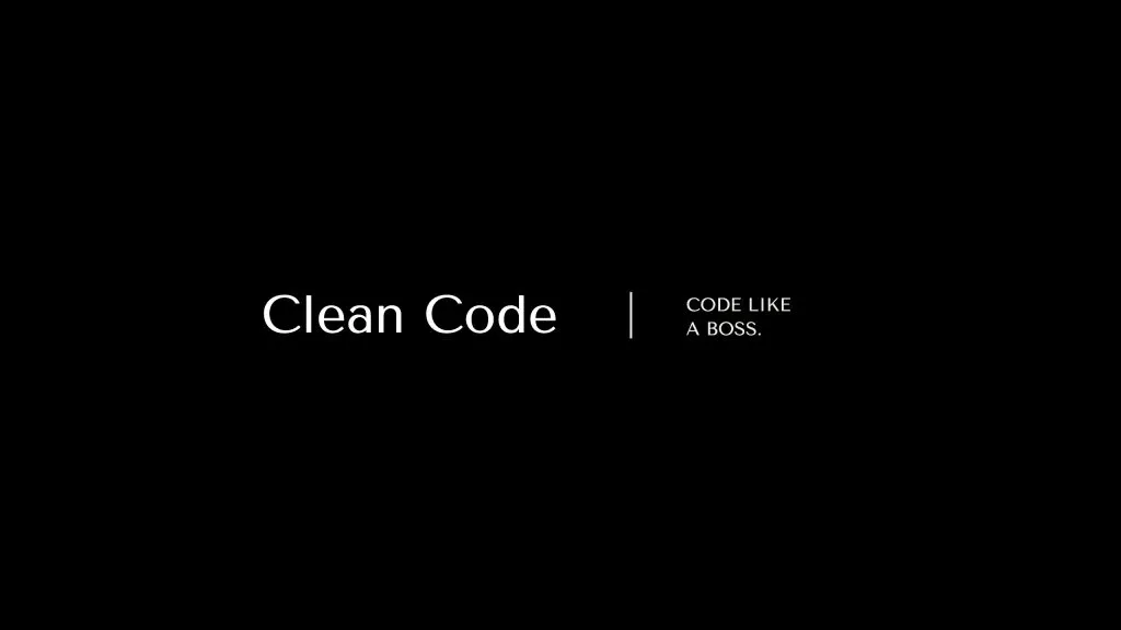
Alright, we know what you’re thinking. A simple black background with white text? That’s it? Well, it may shock you to realize that this YouTube banner design is by a long-shot the top downloaded YouTube banner on Snappa.
Literally thousands of people have flocked to this template as a must-have, and all because it embodies a professional, minimalist modernist look.
There are a couple reasons this design is such a hit for a YouTube channel. First of all, the pure black color is bold, timeless and commanding. Next, the typeface in use “Tenor Sans” is unique and slightly different than your average sans serif font. Also, the vertical line creates a nice divide between the channel name and the tagline. Lastly, with a template this easy-to-edit, you can add your own headshot virtually anywhere in the design!
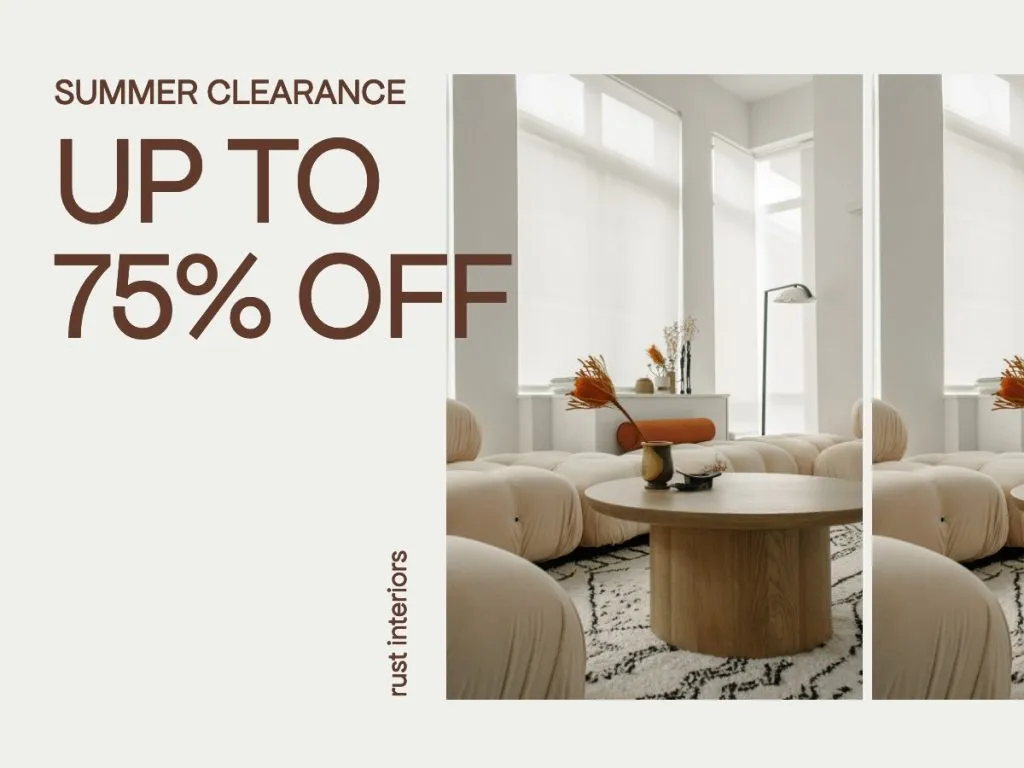
4. Minimalist Billboard Ad
When you’re creating display ads, especially billboard ads such as this one, the biggest thing to remember is that you have virtually no control of how well your ad will be displayed on certain screens and devices. Because of that, taking on the less-is-more approach in your design will be your safest bet.
Using a vivid shade of blue, like our example, ensures legibility as well as creates a visual magnet to the eye. We love the interesting texture of the background image. It offers some variety from just using a white background, but still retains the minimalist nature of the design.
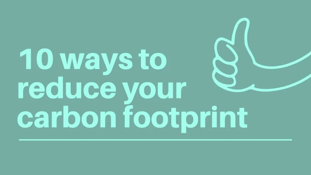
5. Minimalist Infographic
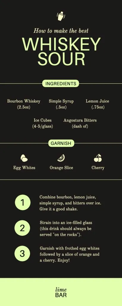
Let’s face it, the infographics that go viral online are easy on the eyes. A well-designed infographic not only displays relevant facts, but makes sure those important stats aren’t lost on a terribly cluttered design!
This design uses color contrast almost like a digital highlighter marker; the light green hue pops against the charcoal backdrop.
6. Minimalist Instagram Story
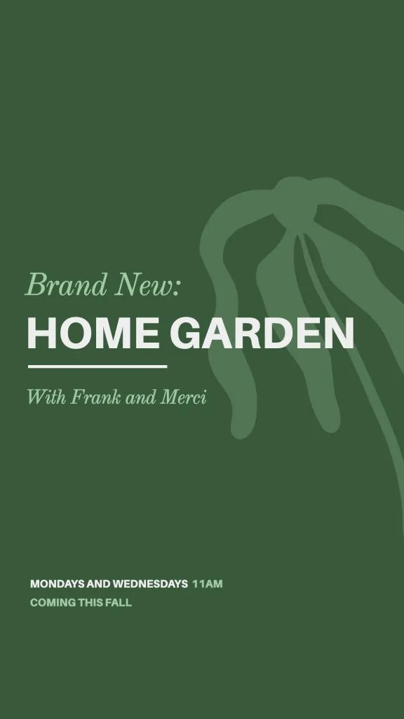
A Instagram story like this one is the perfect place to announce your event. Its monochromatic color scheme offers three shades of green paired with white, as well as two fonts expertly paired together. We love how the background palm tree anchors the design as well as creates a dimensional feel. Notice how each element grabs your attention as well as leads you onto the next one? That’s because great design flows seamlessly!
7. Minimalist Blog Featured Image
A solid white background is an underrated way to create a bright mood. With a grey text color and a carefully placed image, this design feels like it blends anywhere you place it.
Hot tip: By using a softer shade of grey text, your text will feel light and carefree, and won’t run the risk of looking out of place on a plain white background.
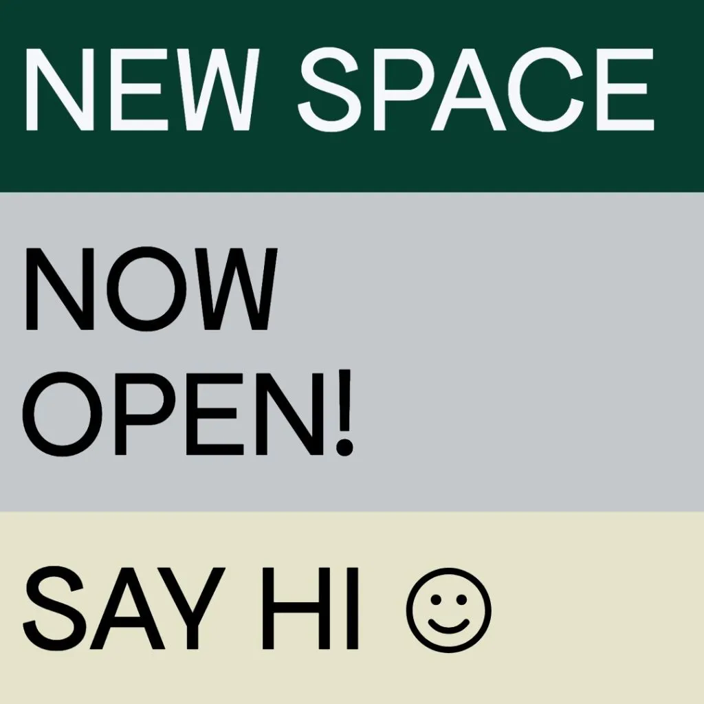
8. Minimalist Facebook Event Cover Image
A fully black and white design is a statement in itself! Looking for a strong and inviting image for your Facebook group? A greyscale design offers a bold and professional approach, and by using white text on a darker background image, your text will stay the central focal-point.
9. Minimalist YouTube Thumbnail
YouTube Thumbnails also rely heavily on the user’s display settings, for them to be seen clearly.
A general rule of thumb when making a thumbnail is not to include too much text, and to avoid adding any secondary text. Keep in mind, most users are seeing the thumbnail on their smartphones, and so you have a very small window (literally) of time for them to view and click.
We love the playful use of the thumb illustration here, as well as the bright and clear text!
10. Minimalist Pinterest Pin
Pinterest is possibly the biggest social media network where minimalism reigns supreme. With that in mind, if you’re creating your own pins or even ads to promote, you’ll want to make sure your photography is striking. Same goes with your layout! A simple layout like this one evokes the same feelings as a modern design magazine, all the while giving your text a perfect spot to sit.
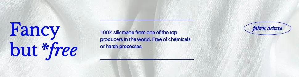
11. Minimalist Email Header
If you often find yourself sending email newsletters, you’re probably on the lookout for a nice email header image. A fun idea is to use the same template each time, but swap the colors subtly each time you send an email, to visually coordinate your graphics with your on-going series!
Extra shout out to this template for using a muted brown color tone that is on par with the huge worldwide Mediterranean design trend.
Final Thoughts
As you can see, minimalism in graphic design has a wide span of styles and moods for you to choose from! There’s no reason to post cluttered overly-designed graphics, when you have these 11 fantastic templates to use! If you liked any of these above designs, you can click on them to use them in Snappa for free! Snappa has thousands of templates, vectors and illustrations, and millions of stock images are added regularly. Get started here.
What are some of your favorite minimalist designs you’ve seen lately? Let us know in the comments below!
