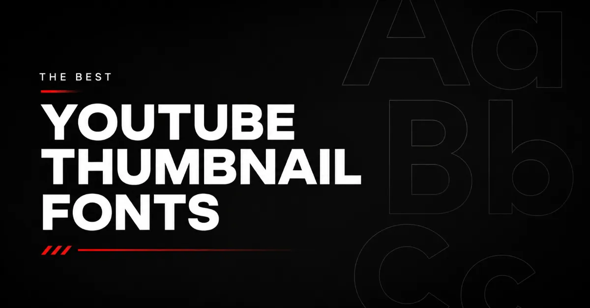
The Best YouTube Thumbnail Fonts to Use for Your Videos
A great thumbnail image can grab attention, highlight your video’s topic, and encourage more viewers to watch. But even the best YouTube thumbnails can fall flat if the text is difficult to read.
That’s why choosing the right YouTube thumbnail font is so important. The best fonts for YouTube thumbnails are bold, visually appealing, and easy to read on all devices.
In this article, we’ll cover the best fonts for YouTube thumbnails, what to look for in a good thumbnail font, and YouTube thumbnail design tips to help your videos stand out.
Best Fonts for YouTube Thumbnails
1. Cooper Hewitt
Cooper Hewitt features a clean, modern look with a professional edge, making it a versatile choice for YouTube thumbnails.
It’s best for tech, business, and marketing content.
2. Aileron
Aileron is a sleek font that feels balanced and approachable. It gives YouTube thumbnails a polished look without feeling too formal.
It’s best for lifestyle, productivity, and tutorial content.
3. Fredoka One

Fredoka One features bold, rounded letters that create a fun and friendly look. Its playful style helps thumbnails feel more welcoming and engaging.
It’s best for family, entertainment, and pet content.
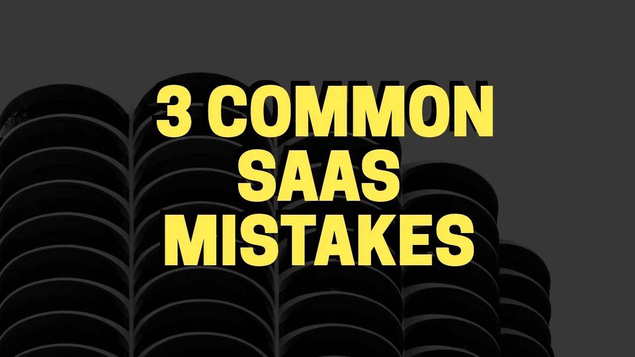
4. Archivo Black
Archivo Black is a heavy font with a strong visual presence, making it ideal for large thumbnail text and bold designs.
It’s best for gaming, sports, news, and podcast content.
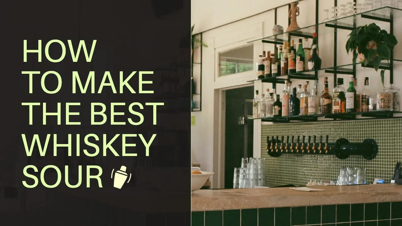
5. Source Serif Pro
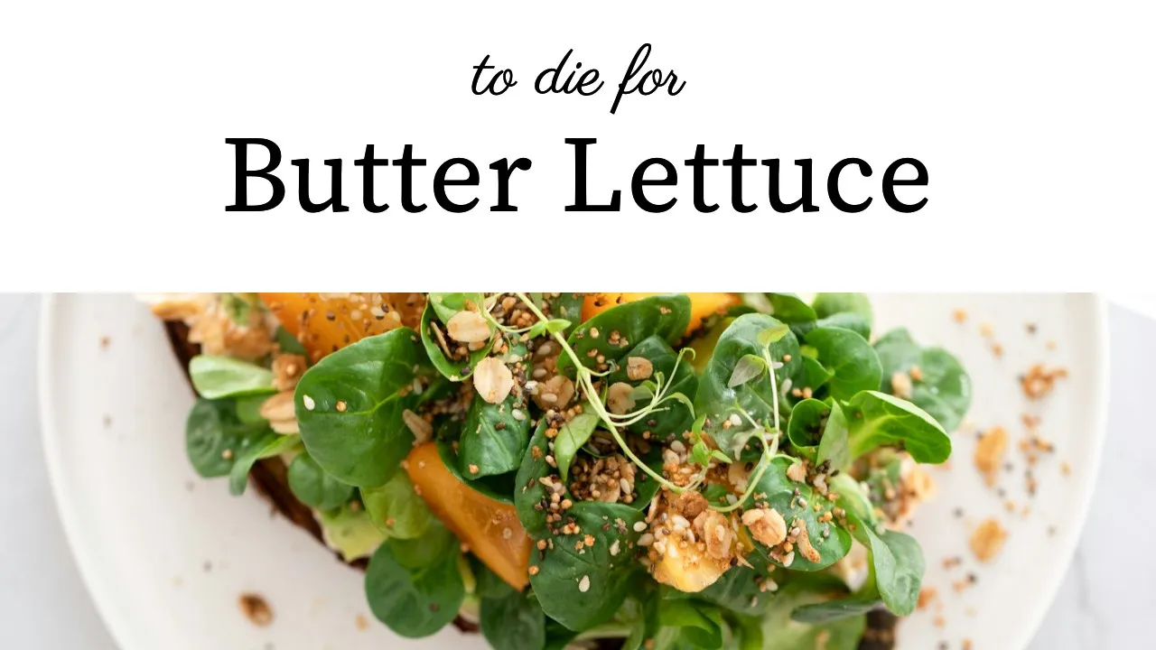
Source Serif Pro brings a timeless, elegant aesthetic to YouTube thumbnails. Its refined structure works well for creators who want a sophisticated look.
It’s best for fashion, luxury, food, and interior design content.
6. Arimo
Arimo is a clean, straightforward font that feels modern and professional. Its simplicity makes it a reliable choice for a wide range of YouTube thumbnails.
It’s best for design, business, marketing, and education content.
7. Lustria
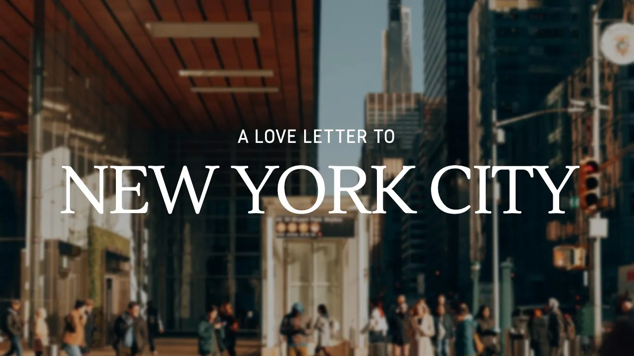
Lustria brings a classic, editorial feel to YouTube thumbnails. It can help designs look more cinematic and story-driven.
It’s best for travel, photography, documentary, and story-telling content.
8. League Spartan
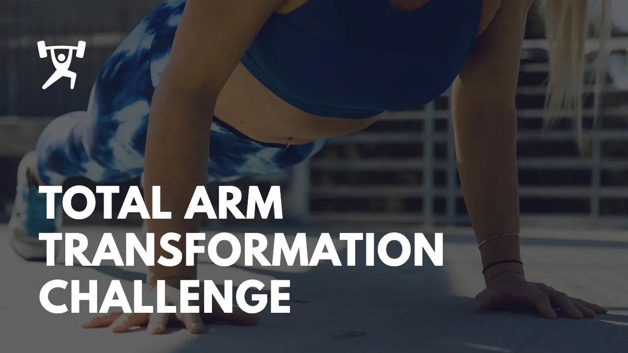
League Spartan is a bold, geometric font that makes thumbnail text stand out. Its contemporary style works well across different video topics and niches.
It’s best for fitness, productivity, and marketing content.
What Makes a Good YouTube Thumbnail Font?
Not every font works well for YouTube thumbnails. Since a large portion of viewers watch YouTube videos on mobile devices, your thumbnail text needs to be easy to read and understand, even at smaller sizes.
Certain fonts work better for specific types of content. An expressive font that works well for gaming videos may not be the best choice for a business or educational channel. Choosing a font that matches your content and audience is crucial.
Here’s what to look for in a good YouTube thumbnail font:
- Readability: Viewers should be able to read the text quickly at a glance.
- Boldness: Thicker font weights tend to stand out more than thin or light fonts.
- Contrast: Your font should be easy to distinguish from the thumbnail image.
- Simplicity: Avoid overly decorative fonts that clutter the thumbnail design.
- Brand Consistency: Use similar fonts across your thumbnails to make your YouTube channel more recognizable and cohesive.
The right YouTube thumbnail font will capture attention, strengthen your branding, and make your thumbnails more effective.
YouTube Thumbnail Design Tips
Choosing the right font is important, but it’s only one part of creating an effective YouTube thumbnail. The best YouTube thumbnails combine readable text, engaging images, and a clear message that viewers understand quickly.
Here are the best YouTube thumbnail design tips to follow:
- Keep text short: Aim for 3–5 words whenever possible. Shorter text is easier to read and understand at a glance.
- Use one or two fonts: Too many fonts can make your thumbnail look unprofessional and difficult to read.
- Use high-contrast colors: Make sure your text and subject stand out clearly from the background.
- Choose one clear focal point: Avoid filling your thumbnail with too many images, graphics, or competing elements.
- Make important elements large: Text, faces, and products should be large and easy to see on all devices.
- Use expressive faces when relevant: Emotions like excitement or surprise can help attract attention and give context.
- Stay consistent with your branding: Use similar colors, fonts, and layouts across thumbnails to make your channel more recognizable over time.
Best YouTube Thumbnail Examples
Now let’s look at some of the top YouTube thumbnail examples.
These thumbnails use strong typography, sharp visuals, and the best design practices to capture the attention of viewers.
GoPro
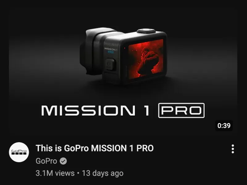
This thumbnail from GoPro features a close-up product image with a sleek, modern font.
It works because the clear focal point draws interest and quickly highlights what the video is about.
Airrack
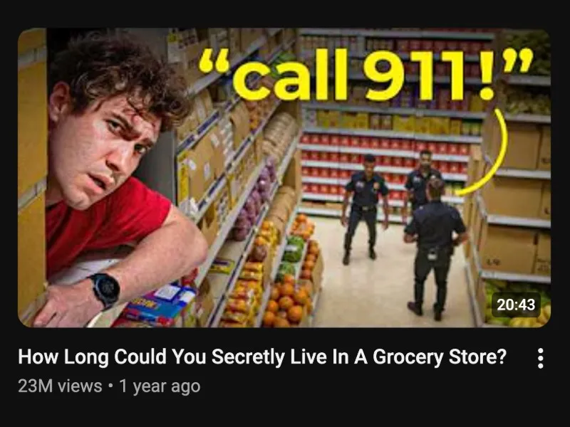
This thumbnail from Airrack combines an expressive facial expression, bold yellow text, and an engaging background image.
It works because the design creates curiosity and encourages viewers to find out what happens in the video.
Satori Graphics
This thumbnail from Satori Graphics places large, bold text behind a close-up portrait alongside logo graphics.
It works because the bold font choice, close-up subject, and recognizable logos create a strong visual hierarchy that captures attention.
Lost LeBlanc

This thumbnail from Lost LeBlanc combines a handwritten-style font with bright colors and a scenic travel image.
It works because the vibrant colors, smiling subjects, and font choice create an inviting design that reflects the adventurous theme of the video.
My Self Reliance

This thumbnail from My Self Reliance places large text in the top-left corner alongside a warm outdoor background image.
It works because the strong contrast makes the text easy to read while creating a clear focal point.
Wrapping Up
Picking the right font can have a big impact on how your YouTube thumbnails look and perform. Focus on fonts that are easy to read, fit your content style, and help reinforce your brand.
If you’re looking for the best YouTube thumbnail fonts to start with, fonts like Cooper Hewitt, Aileron, League Spartan, and Arimo work well across a wide range of YouTube content.
Hopefully this article gives you a few new font ideas to test in your next YouTube thumbnail design.
