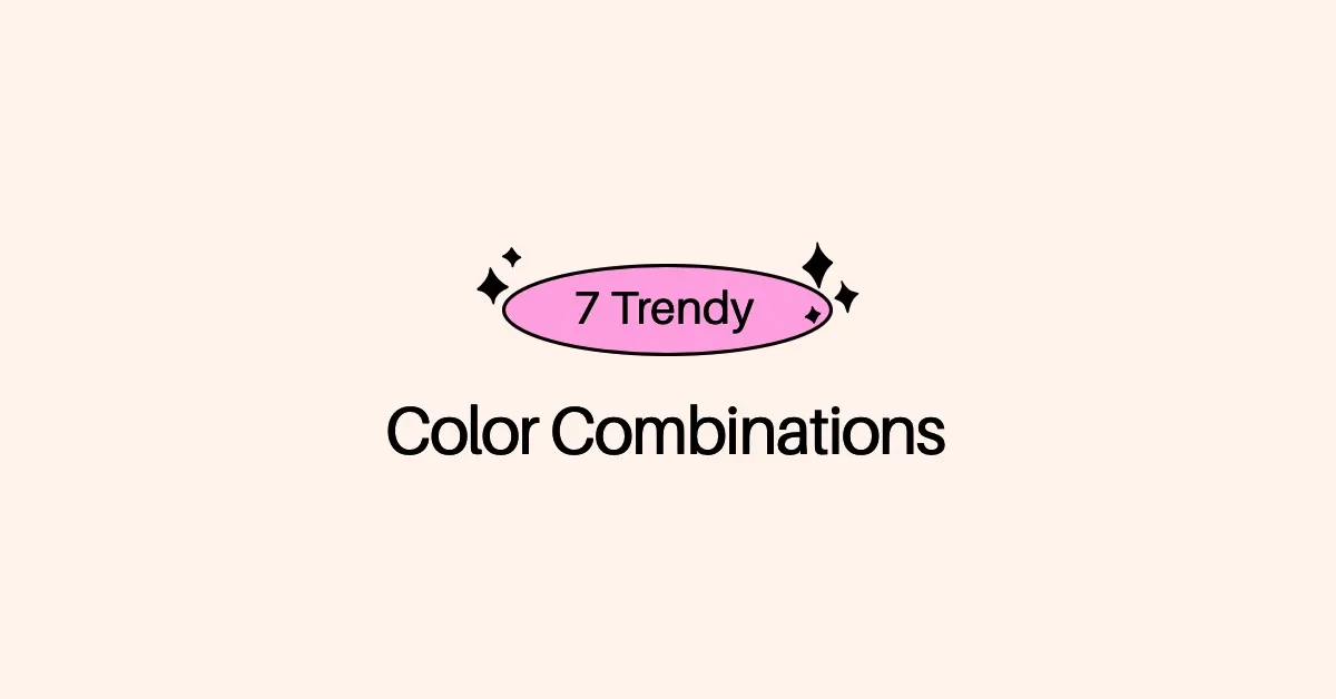
7 Trendy Color Combinations To Try Today
Trendy palettes and color combinations are essential in communicating your brand’s message in a powerful way.
Colors can influence emotions and help drive your audience to take action. When you establish your brand, it’s essential to choose visuals that help to communicate the voice, tone, and ultimate purpose behind your brand.
For example, bright colors can help to illustrate a fun, energetic brand. On the other hand, cool or calming colors can help your audience understand that your brand is all about bringing a sense of peace in an otherwise hectic world.
Looking for some inspiration and new color combinations for your brand? Let’s take a look at some trendy color combinations and palettes you can incorporate into your content marketing to re-energize your brand’s look and feel.
1. Futuristic Color Combinations
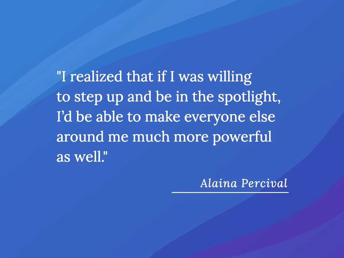
Futuristic color combinations that don’t occur in nature work well for many brands. Whether you’re depicting a human in unusual, eye-catching colors or sharing an abstract image, these palettes never fail to grab an audience’s attention. Combining bright colors can give an image a surreal, fun, or futuristic feel, depending on your goal for the imagery.
Take a look at the following social media template that we created in Snappa. Its gradient of blues, purples, and pinks is modern and futuristic, while the sleek graphic design adds a modern, trendy element to the overall aesthetic. The contrast of the bright green catches the eye and guides it to the text.

2. Soothing Palettes
A soothing, calming color palette can convey a range of emotions you want your followers to feel when they encounter your brand.
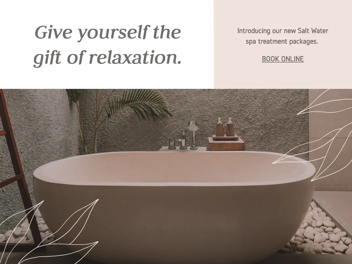
If your product or service promotes relaxation, such as a spa or self-care product, then using a soothing color combination to complement your copy is an excellent way to get users’ attention.
This image is a great example of adopting muted colors and nature elements to create an atmosphere of calm. Don’t be afraid to use your copy to support the emotions you’re working to elicit in the viewer.
Choose font colors that fit the mood. Select one of the exact colors of the image to maintain the palette, or use one of your established brand colors, whichever is most appropriate for your situation.
3. Asymmetrical Color Blocks
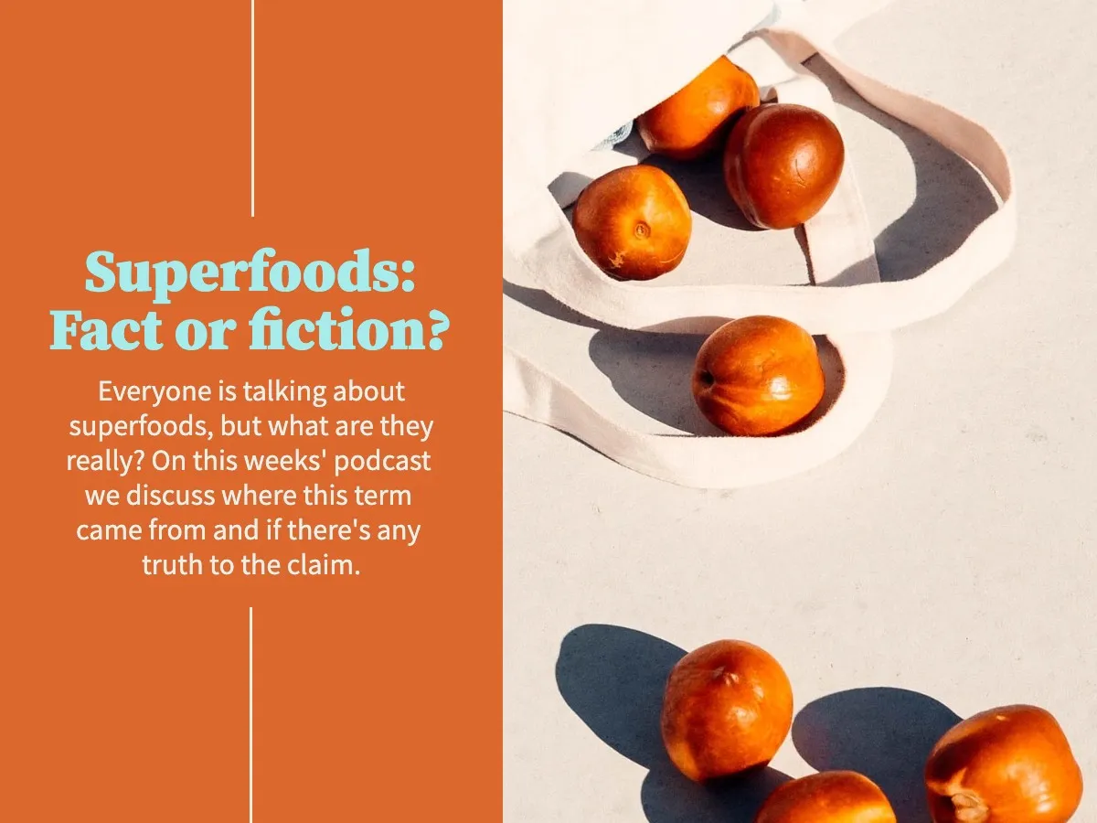
Using asymmetrical color blocks in your designs can help you incorporate a wide palette of colors while avoiding the sometimes harsh lines and shapes of a geometric design.
These are great palettes for brands with a nature-centric or artistic focus. If your brand celebrates the natural world through its established design, then using asymmetrical color blocks in some of your graphics can be a great way to use your brand colors in a unique way.
Take a look at the following image, which uses muted summer colors of sage, burnt yellow, and light pink in asymmetrical color blocks. There’s an unmistakable natural flair to the design, although there are no actual depictions of nature in the image. Sometimes, color is all you need to set the tone for a specific season or purpose.

4. Analogous Color Schemes
An analogous color scheme incorporates a range of colors that appear beside one another on the color wheel.
Using an analogous color combination can give your brand the cohesive look and feel of a monochromatic color scheme, which limits you to only using one section of the color wheel, but offers more options and flexibility for the combination of colors you ultimately choose.
5. Images That Feature a Spectrum of Skin Colors
Many brands put the spectrum of skin colors front and center in their marketing. If you have a product or service that centers on people—particularly on healing or beauty—you can easily incorporate a skin-toned color palette or photography that features a diverse range of real people.
Jewelry, skincare, and self-care brands are all great candidates for this kind of imagery. Thankfully, with the huge amount of great stock photo resources available these days, you don’t need to be a pro photographer to find high-quality images such as these.

6. Bold Colors With High Saturation
Using bold color combinations and palettes with high saturation is a great way to catch your followers’ eyes. A complementary color palette works well with bold colors. Additionally, incorporating a light-colored background, such as in the image below, can really make the bold elements in your image stand out. A great place to use saturated colors is in your YouTube thumbnails, where you really want your design to pop.
Play around with your color options—within the parameters of your brand’s style guide, of course. Free tools such as Paletton provide a color wheel for you to create your own unique color palette.
7. Muted Earth Tone Palettes
Sometimes, muted colors can be a sleek, clean way to present your brand to your audience.
Muted earth tone palettes are sophisticated and calming, helping your viewers to feel centered as they take in your brand message without overpowering them. The natural world offers such a wide range of colors that the possibilities are far-reaching.
While you can use patterns or images to convey muted earth tones, consider incorporating them in your graphic design in simplistic ways. For example, the image below features small color blocks and a clean font. There’s nothing too busy going on, but the color combination feels soothing to look at. There are definitely a ton of cool design styles to consider, but this simple and minimalist banner will perform well in basically any context.

Conclusion
The color combinations and palettes you choose to incorporate into your brand’s visuals can communicate so much to your audience. You can use color to influence how they feel any time they encounter your brand, as well as to convey important information about what you have to offer them.
And if you’re still stumped about the colors that you should choose, don’t sweat; Snappa has an abundance of ready-made templates that you can customize as you see fit or draw inspiration from, all of which are strong color combinations that will help you stand out.
Snappa offers a wide range of images and graphic design elements to help you create those eye-catching designs. Want to give it a try? You can get started for free here. Have you found any cool color combos lately? Let us know in the comments below!