Email Banner Size: What You Need to Know
Email is likely the way you keep in touch with your most loyal subscribers. That means it’s important to make sure that your email newsletters, including email banner size, look great and keep their attention.
Setting up your email marketing for the first time or tweaking your design ahead of a new promo or lead magnet launch? You’re going to need a strong email banner that plays well with your brand, is easily visible and legible on both desktop and mobile screens, and helps to move your subscribers into action.
Including the right email banner size in your newsletters is key to making each send look its very best—which can only help your chances of boosting that conversion rate. In this post, we’re going over everything you need to know about email banner size, so let’s get into it.
Email Banners: Why Do They Matter, and Do You Need One?
If you run an online business, chances are you either have an email newsletter already, or are planning to. For most brands, email marketing makes up a significant portion of their conversions and overall reach.
Some email marketing platforms are more text-driven. While that works for some businesses—particularly content marketers and solopreneurs—an eye-catching image can really level up the customer experience.
A well-designed email banner that’s properly sized can be a real game-changer for your newsletter. Selecting a sharp, high-quality image that fits well into your overall brand aesthetic is essential if you want to snag your subscribers’ attention and keep them reading.
Recent data from Constant Contact shows that emails containing three images or fewer tend to have higher click-through rates than image-heavy emails. That means the newsletter images you choose, including their sizes, brand alignment, and overall aesthetic appeal, should knock it out of the park.
A beautiful photograph or graphic that fits seamlessly into your brand’s visual identity is just one important step in this process. Choosing the correct email banner size will be the deciding factor in whether or not the image is a hit.
The Best Email Banner Size for Your Newsletter
Currently, the standard accepted width of email designs, in general, is 600 pixels. Email banner sizes should follow this lead as a general guide, keeping in mind that mobile phone screens will scale this image down. Since 53% of users open their email on their smartphones or other mobile devices, this is particularly important.
At Snappa, our email banner templates are sized at 600 x 200 pixels. If you want to create a larger image that’s capable of scaling up, then we recommend going no wider than 650 pixels. Test your images on mobile, too, so you can tweak your email banner for the smaller screen. In terms of width, roughly 350 pixels seems to work well for mobile.
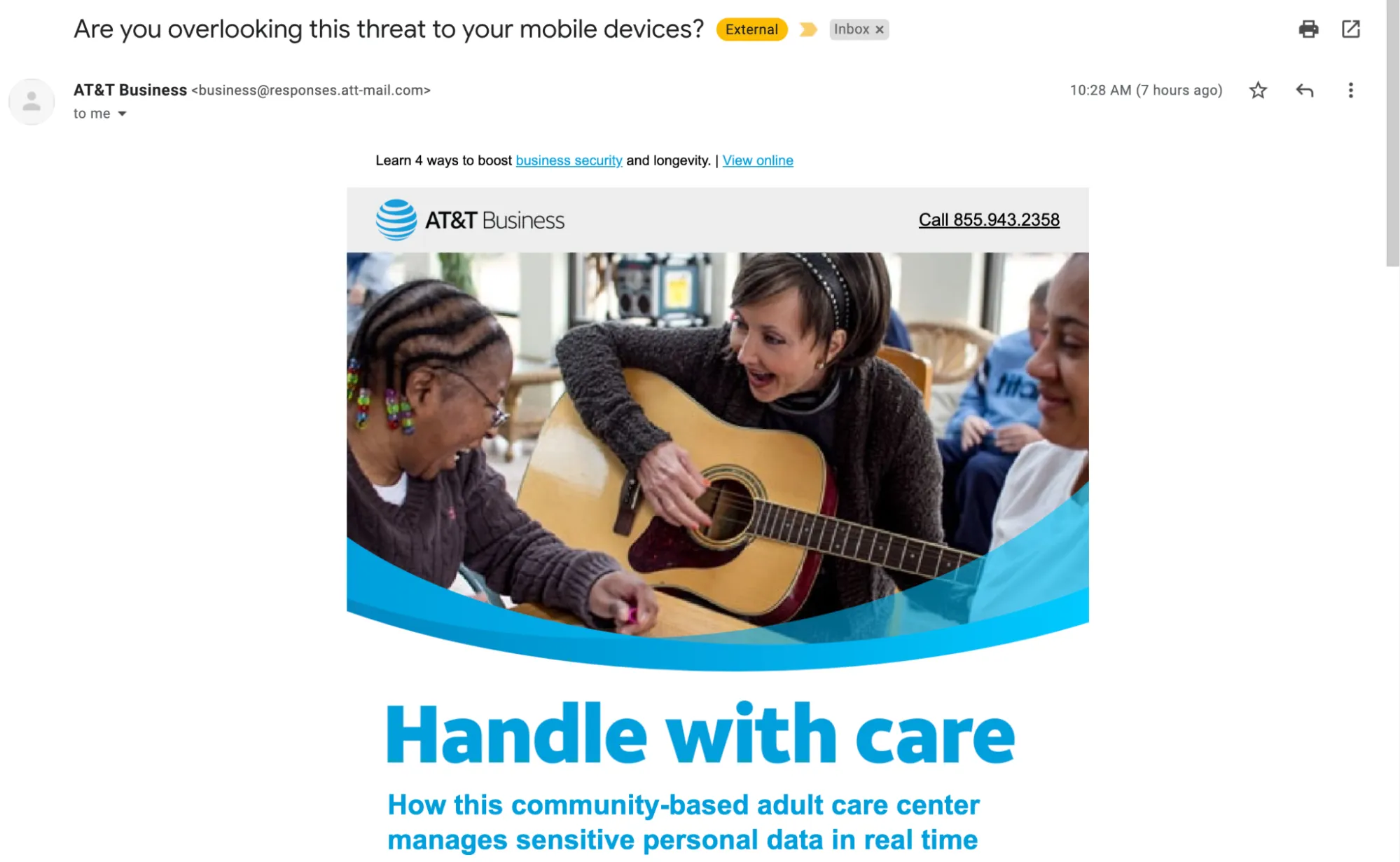
Consistently, we’ve noticed that even when we open emails at full resolution on desktop, their designs do not scale up as a website browser display might. Most brands do this to ensure the banner will display well on a variety of devices. Take a look at this email from AT&T:
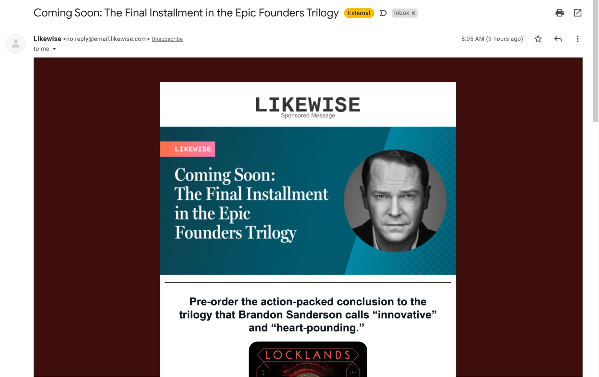
The app Likewise frames its email design with a background color to take up more real estate on the screen. However, you’ll notice that the email banner size remains much narrower than the full display.
Sometimes, you might notice that email banner heights vary. We’ve seen smaller heights, even as small as 90 pixels.
Email banner sizes display well all the way up to 200 pixels in height. If you’re optimizing the image for mobile, then the height should do well right in the middle-around 100 pixels.
You might find that the ideal email banner size varies based on your email marketing software and email client. Ultimately, you’ll need to experiment with designs and sizes—and don’t forget to test until you find what works best.
4 Email Banner Styles to Make Your Next Newsletter Pop
Thinking about redesigning your newsletter and optimizing your email banner size? Here’s a little inspiration for your new design.
1. Color Gradient
Is your brand fun, vibrant, and full of life? Using a minimalist design against a color gradient background can really make your email banner pop. For multicolored images like the one from Snappa below, we recommend leaning on clean fonts and 2D graphic design elements that don’t take away from the color.

2. Text-Centric Banner with Color Blocks
Centering your email banner around text makes for a clean design that’s easy to read and doesn’t shy away from white space. Don’t be afraid to keep your email copy minimal. Keep an eye on your font sizes and test them on mobile screens to make sure subscribers will be able to read the copy without a problem.

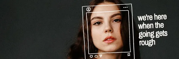
3. People-Focused Designs
If your brand is all about making personal connections with your customers, you may want to consider extending this connection to your email newsletter. Using faces to represent your brand can communicate so much about your intent.
For instance, the email banner below sends a clear message of support to the viewer. It’s clear that the brand’s intent here is to help the recipient feel as though they have someone to turn to in difficult times.
4. Product Photography with Minimal Text
Does your newsletter primarily represent a product-based business? Use your email banner to showcase what you offer. Pay attention to the use of text in these designs, ensuring the image is front-and-center. Keep the text relatively small to give focus to your image, and your banner will be a major win.
Tips and Best Practices for Your Email Banner
Depending on your email newsletter ideas, there are many ways to get your message across and help it look great in the process. Here are some important best practices you can start following to take your newsletter to the next level.
- Make use of “white space,” letting your email banner design breathe. If it’s too busy or you try to cram a lot of text into a small image, users won’t be able to read it.
- Use readable and clear fonts. Snappa’s template tool features a wide range of fonts you can choose from to get your message seen.
- If you select a photograph for your email banner, make sure it’s sharp, high-quality, and easily discernible. You want your subscribers to know exactly what they’re looking at when they open your emails.
- Use color combinations that work well and fit with your brand design. If you need help landing on the right color scheme, Adobe Color generates combos that work well together, such as complementary and monochrome palettes.
Conclusion
Email banner size is incredibly important to your newsletter and overall marketing strategy. Having a well-designed email means positive results are more likely when you reach out to your subscribers.
You don’t have to be a professional graphic designer to get amazing images and the optimal email banner size. With our library of email banner templates and design tools, Snappa makes it quick and easy to create your banner without a fuss. Even better, you can get started for free here.
Have you seen any great banners from brand emails? Let us know in the comments!