5 Types of Facebook Ad Images You Should Test
Let’s talk Facebook Ads.
Facebook Ads have helped small and large businesses alike reach new customers and sometimes drive massive amounts of sales, often at a relatively low customer acquisition cost (CAC). If you want to get those results, though, it’s always a good idea to start with a great strategy, strong copy, and (of course!) great ad images.
Your Facebook Ad images are going to be the first thing that users notice when they see your ad. It is responsible for grabbing their attention enough that they want to read your copy and/or click.
Videos, GIFs, and images are all great, but in this post, we’re specifically going to look at Facebook Ad images. In many cases, images are faster, more affordable, and more accessible for small businesses to create at scale than video.
So, let’s take a look at five different types of Facebook Ad images that you should be testing in 2023.
1. Product Images with a White Background
These are images that you likely already have if you’re an eCommerce business selling physical goods: They show the product being displayed over a white or otherwise neutral background.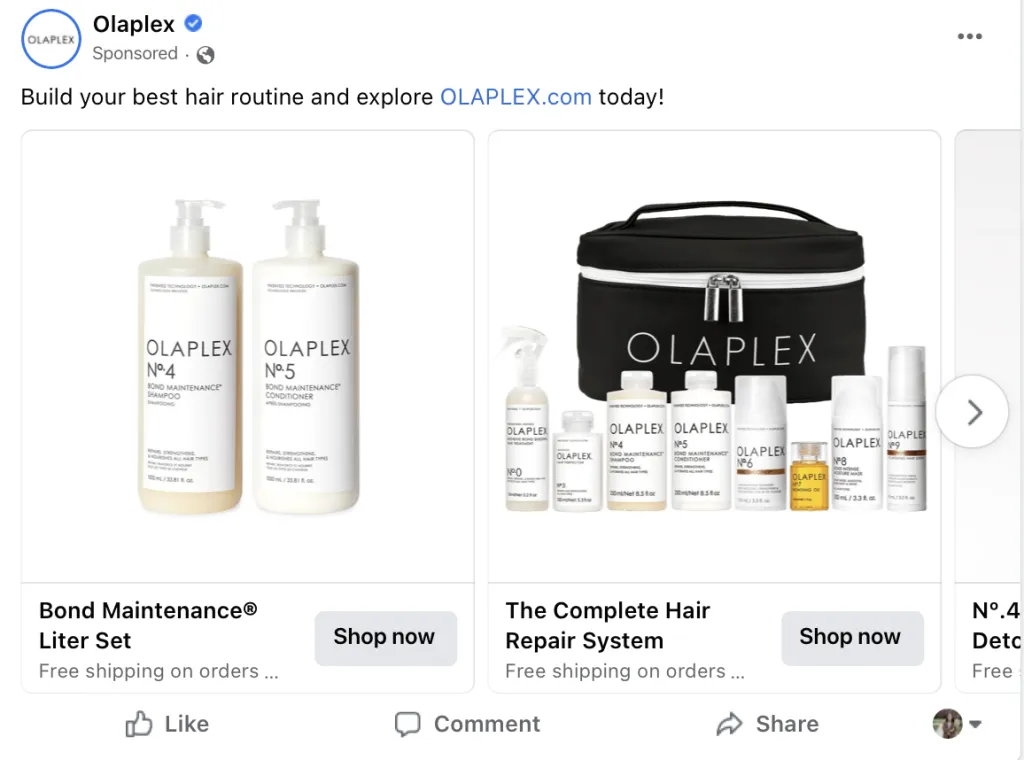
These are images that you’re likely using in the search function for your site and in product thumbnails. They work well in Facebook Ads because they keep the entire user’s focus on the product themselves, as opposed to making users guess what you’re actually selling.
And, since you already likely have them on hand, there’s no harm in testing them! They often do particularly well in the carousel ad format like what’s featured in the example above.
2. Products in Use
Showcasing products in use is another outstanding and popular choice when you’re considering types of Facebook Ad images to add to your campaigns.
These images will show the product in “the real world” and may actually be in use by a “customer.” So instead of having a picture of a makeup brush on a white background, it may be on a counter, or be in use by an actual person.
These images can help potential buyers visualize the item in their lives. For slightly more complex products, it may also show them how the product is used or provide perspective on size, style or color.
In the example Facebook Ad below, choosing to show the products in the real world was a smart choice. People can see how the items are styled and envision the chair or bookshelf in their home, with ideas for how to use them.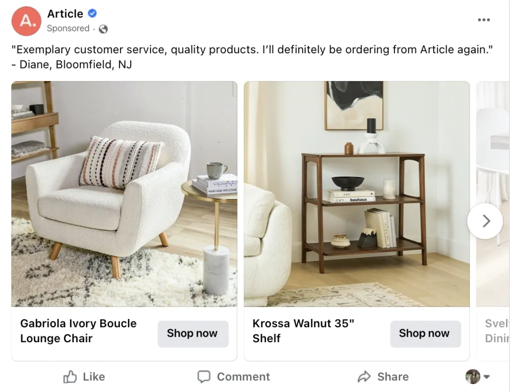
And here’s another example that combines the first and second types of Facebook images we’re discussing today to great effect. Liverpool shows three different items over a neutral background, and then puts them all together on a model. This is a great way to show users that they can buy every single item from the brand (not just the blazer, which the copy almost implies) and shows them how to put an outfit together.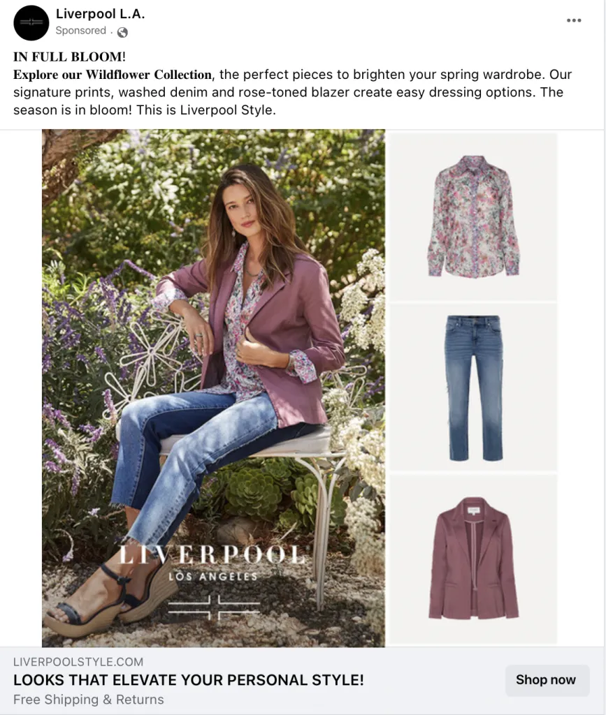
3. Reviews Added in Overlay
Reviews are unbelievably powerful in marketing, and that’s just as true for Facebook Ads as it is in all other touchpoints of the buyer’s journey.
Plenty of ads will drop user reviews in the copy of the ad text, but a great way to capture user attention and interest quickly is to put a short snippet of reviews that really feature your USP in the image using a text overlay.
When we say short, we mean it— think no more than a sentence or a phrase. Put it in quotes so that it’s clear that it’s coming from a customer, and use plain text that’s easy to read. And make sure it’s only a small part of the image, with an image of the product or service taking up most of the space.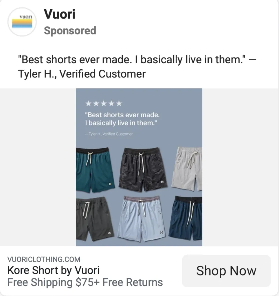
4. Graphics
Some businesses are advertising services or even SaaS tools that maybe don’t have product images the same way eCommerce businesses do. In this case, you can’t go wrong with designed graphics.
HubSpot recently ran an ad using graphics to promote their Google Ads integration, which is a core use case for many customers.
The image is simple and uses contrasting-but-branded colors to draw attention, with the top box featuring the benefits and the bottom graphic box showing the integration icon. It’s quick to create (especially with a tool like Snappa, which uses drag-and-drop design tools to make the process fast and easy!), and it can work well for your campaigns.
5. Product Breakdown Images
Product breakdown images are well worth testing, though you’ll need to make sure that the images are large enough and the image isn’t so cluttered that it takes away from what you’re trying to do.
This type of Facebook Ad image will have a picture of your product and text overlay that highlights different features or benefits of the product. In the example below, you can see a combination of features and benefits, like “keeps you warm under a jacket,” “ultra buttery soft,” and “100% non-see-through.”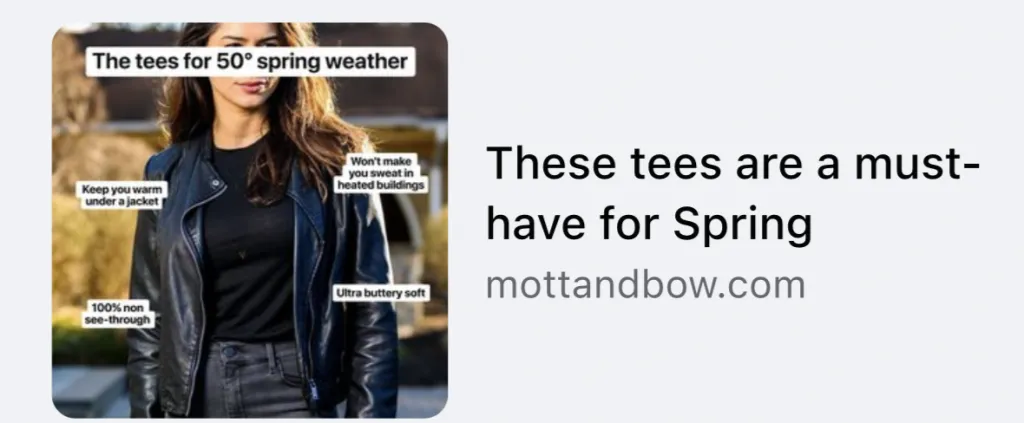
This image type is commonly used to showcase distinct features that will set the product apart. A brand selling a grill might highlight the non-stick grill grates that are easy to clean, and the option to use either propane or electric. Showcase the features that you know that users most need and that can impact their experience.
Final Thoughts
There are so many things to consider when creating Facebook Ads, and your visuals are definitely one of them. Remember that videos are also valuable to use on Facebook Ads; this post just happened to focus on images. Ideally, create a library of both videos and diverse images and let Facebook do the testing and optimizing for you since their machine learning has really taken off.
Need help designing great images for your Facebook Ads? We can help! Get started with your free trial of Snappa here.