
A well-designed landing page is no small feat! People might underestimate the necessity of a great landing page, but it’s crucially important for creating a strong first impression.
Using a landing page (sometimes called a “One Pager”) is the best way to make the process of converting customers simpler and easier. Sometimes, having multiple pages on your site can feel bloated and cause decision-fatigue, but a great looking landing page makes things simple and straight-forward, as it has all the information right there on a simple and easy-to-scroll page.
Whether you’re looking to create a page for a product, a CTA to join an email list, or an infographic-like page with important stats, we’ve curated 8 great looking landing pages for inspiration. While these range widely from each other stylistically, they were all created with the shared goal to create an engaging user experience.
So if you’re in the market for a new landing page, you’ll definitely want to check these out! These 8 pages will serve as inspiration and motivation to create an amazing landing page for yourself. Enjoy!
8 Great Landing Page Examples
1. Condo Leasing Landing Page Example
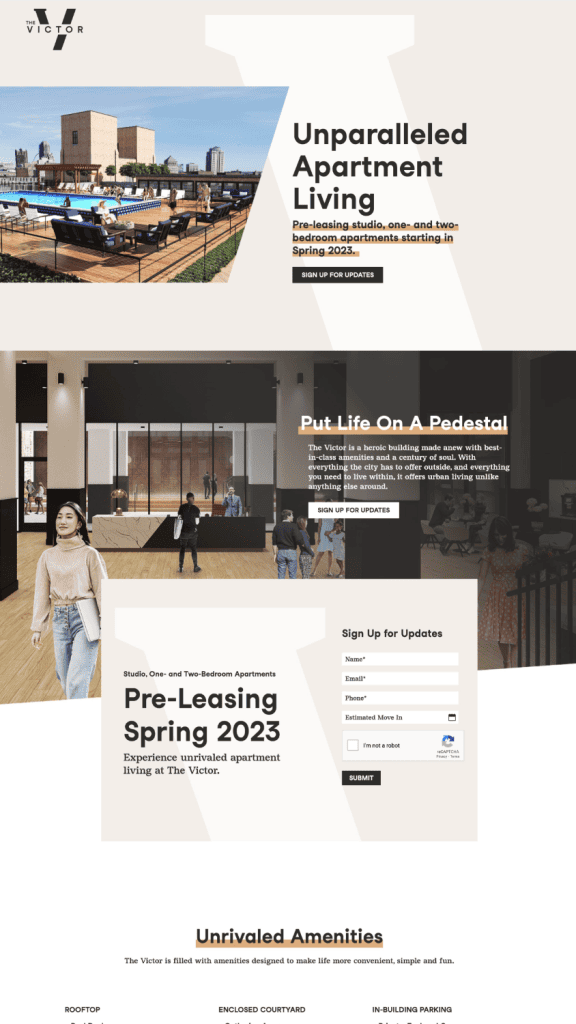
First of all, we have this long-scroll page for a new condo development. Neutral colors, bold sans serif typefaces, and thick underlines all draw your attention to the most important details on the page. There’s a sign-up box near the top, giving you the sense of urgency to sign up (while you still can)!
We especially love how the “V” for Victor adds cohesive branding to the page, as it appears in a lighter color as part of the background pattern.
2. SRQ Weekly E-List Landing Page Example

Next up, we have this clean one page for SRQ Weekly, a curated events newsletter for Sarasota, Florida. Simple and inviting, the page immediately tells you what you’re signing up for: a weekly roundup of festivals, community events, and family-friendly happenings in the local area.
Its design features a calming teal color palette that evokes coastal Florida vibes, paired with generous whitespace that keeps the focus squarely on the signup form. The bold, uppercase wordmark creates instant brand recognition without overwhelming the page.
SRQ Weekly’s landing page is a masterclass in restraint—proving that a local newsletter doesn’t need flashy graphics or cluttered layouts to convert. The friendly “local guide” tone comes through in every design choice, making visitors feel like they’re getting recommendations from a neighbor rather than subscribing to just another email list.
3. Cooking Course Landing Page Example
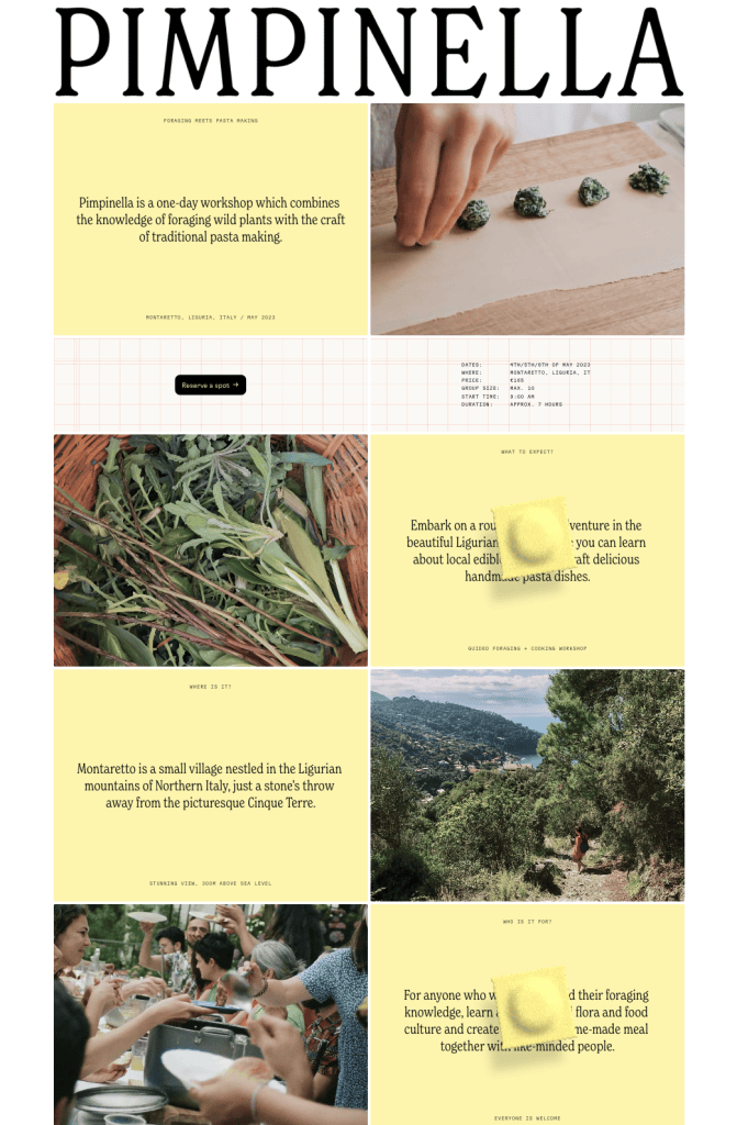
Pimpinella’s page has the same vibe as a glossy full-color brochure. As a pasta making course, they featured pasta-like hues of yellow in their overall design, which is a fun touch that adds a friendly mood to the content. The page is a long-scroll that alternates between images and text, showing that the art of storytelling is as delicate as making pasta itself.
Kudos to them for including a video loop on the page that somehow takes up visual space without distracting the eye.
4. Coding Course Landing Page Example
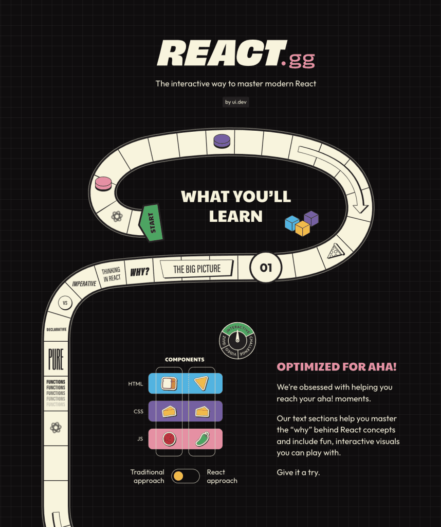
React.GG’s landing page is the most playful so far. The page is for a course to master React, an open-source Javascript library, but the whole site scrolls like a board game. Your inner child will surely smile at the sight of this! The subtle grid pattern in the background feels technical and balances the playfulness with a sense of professionalism.
5. Dance Academy Landing Page Example
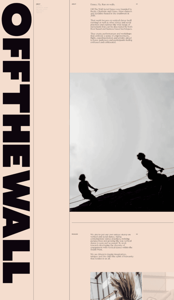
Here is some vertical text that’s as bold as it is dynamic. This dance academy page gets extra style points. Teaching a style of dance that requires wall running, the genius vertical placement of the text creates that same sense of movement. The bold black text pairs well with the muted pink background color, and the whole thing reads like a high-end art gallery. To represent something so movement-oriented as dance is an art itself, and this design does so with great impact.
6. Coffee Table Book Landing Page Example
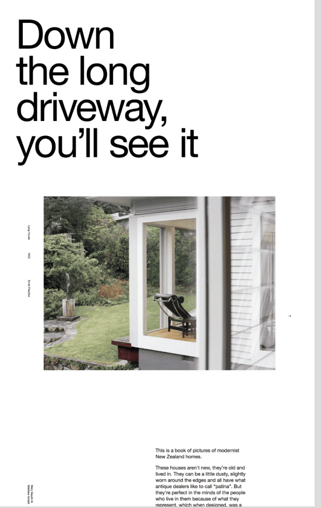
This page is for a book of photography of beautiful modern homes in New Zealand. The landing page offers a clear explanation of what the book is, and the layout of the page itself is very much like a coffee table book. The artfully-blended photography and text, shows that the perfect amount of whitespace creates a gallery-like experience for the viewer.
Bonus points for how the window in the photograph frames the chair as if on display in a museum. They say an image is worth a thousand words, and this one, without words, visually explains the intent of the book itself!
7. Finance Landing Page Example
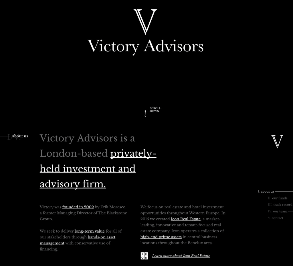
Victory Advisors, a London-based investment firm, felt no need for color as they created this black and white design. The combination of their serif fonts and pure-black creates the impression this firm is solid and reliable.
Color is completely avoided in this design theme, which feels like an intentional way to prove their professionalism and build trust. Pure-black backgrounds can be a great asset for all things finance; your fintech company, financial planning site or crypto-related blog can all benefit with a dark-mode style!
The only italics on the page is the underlined “Learn more” sentence at the bottom, which pairs well with the square logo to grab your attention.
8. Spotify Landing Page Example
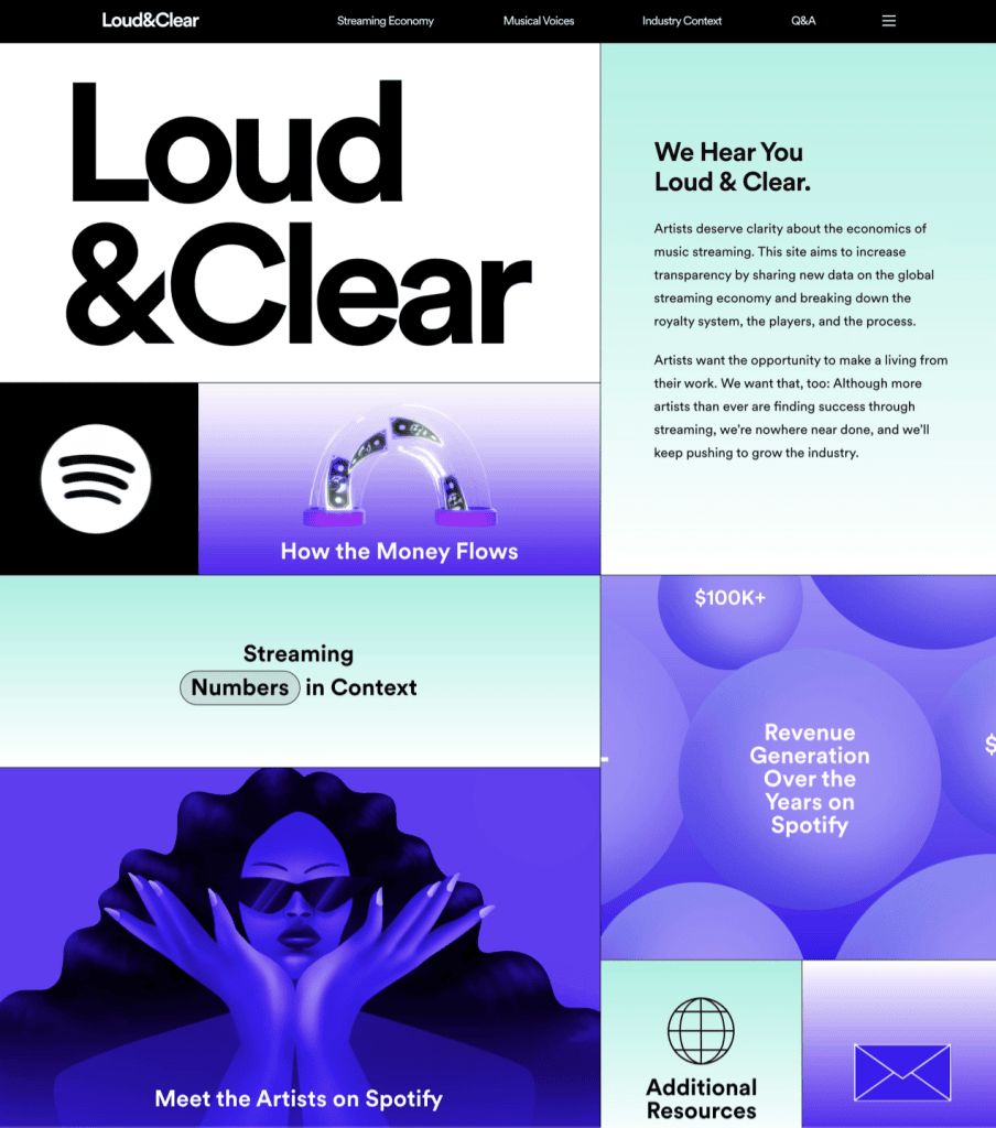
Spotify made this page to offer transparency to their Artists on how their Stream revenue is determined, and the process in which it is accumulated. The title of the page “Loud & Clear” is of course loud and clear as a bold and literal statement. The page scrolls like an infographic, blending Spotify’s famous purple color with gradients, icons and on-trend illustrations.
Rather than just issue a written statement, Spotify created this on-trend guide to their payment process, with eye-pleasing cohesive design to engage the reader and communicate their vital information.
Final Thoughts
As you can see, there are no right or wrong styles for landing pages! It’s really a matter of choosing what feels best for your own brand, and sticking to it. Whether you’re creating a page for a fintech company or a golf newsletter, rest assured, there’s no single right way to do it. Your visuals are entirely up to you! As long as the information you’re conveying is well displayed, and your CTA is enticingly click-worthy, you’ll have an awesome landing page.
We hope you loved these cool pages from all over the net, and that you’re feeling inspired! Have you seen some cool landing pages lately? Let us know in the comments below!
