The Best Colors for YouTube Thumbnails (With Examples)
Color plays a major role in how viewers perceive your YouTube thumbnails. The right colors can help your thumbnails stand out in a crowded feed and make your videos more recognizable.
However, not every color has the same impact. Some colors naturally attract attention, while others are better suited for specific types of content.
In this article, we’ll look at the best colors for YouTube thumbnails, along with examples and tips for using them effectively.
Blue: Confidence & Clarity
Blue can help thumbnail designs feel polished and professional. It pairs well with white text and works best when you want your content to appear informative, credible, and easy to follow.
Represents: Confidence, clarity, and professionalism.
Best for: Technology, business, educational, and productivity content.

Yellow: Enthusiasm & Optimism
Yellow can bring energy and excitement to YouTube thumbnails. It’s often used to highlight important text or design elements, and works well when paired with darker colors that help it stand out.
Represents: Enthusiasm, optimism, and energy.
Best for: Entertainment, lifestyle, and travel content.

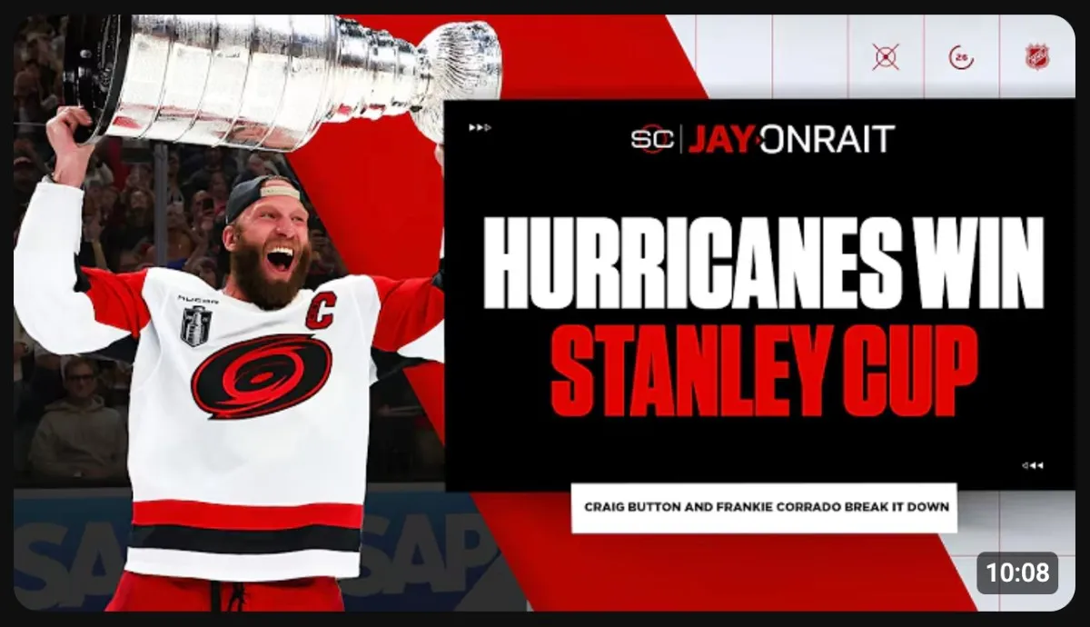
Red: Urgency & Intensity
Red is one of the most attention-grabbing colors used in YouTube thumbnails. It can help emphasize important topics, create impact, and draw viewers toward key elements within the design.
Represents: Urgency, intensity, and action.
Best for: Sports, news, challenges, and digital marketing content.
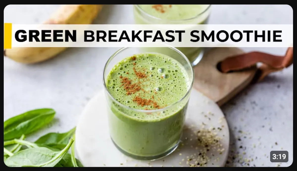
Green: Growth & Balance
Green can help thumbnails feel fresh, positive, and approachable. It’s often associated with progress and success, making it a natural choice for content focused on improvement and personal development.
Represents: Growth, balance, and prosperity.
Best for: Health, self-improvement, finance, and educational content.
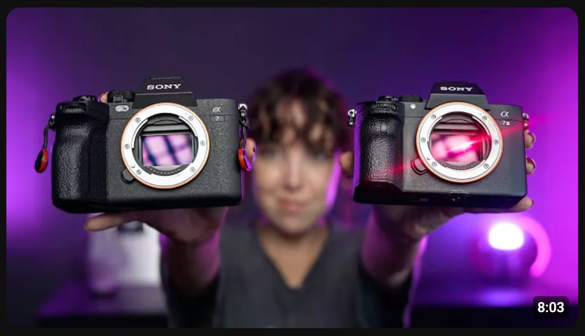
Purple: Creativity & Innovation
Purple can give YouTube thumbnails a sharp look that draws the eye. It works well for creators who want their content to feel innovative and visually unique.
Represents: Creativity, innovation, and imagination.
Best for: Gaming, creative, technology, and AI content.
Orange: Friendliness & Warmth
Orange can help thumbnails feel warm and inviting. It stands out well against darker backgrounds and can make content feel easy to engage with.
Represents: Friendliness, warmth, and adventure.
Best for: Food, lifestyle, travel, and fitness content.

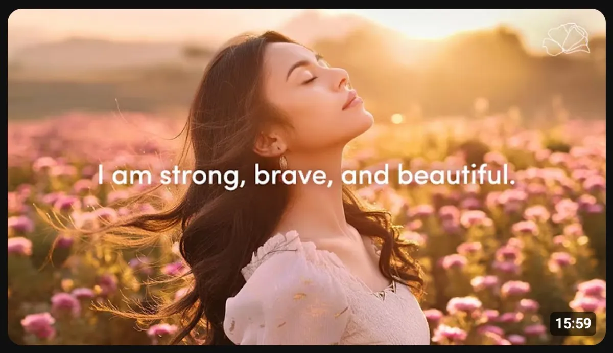
Pink: Softness & Playfulness
Pink can help thumbnails feel light, playful, and visually inviting. It’s often used to create a softer aesthetic and can give designs a comforting feel.
Represents: Softness, playfulness, and comfort.
Best for: Beauty, fashion, lifestyle, and design content.
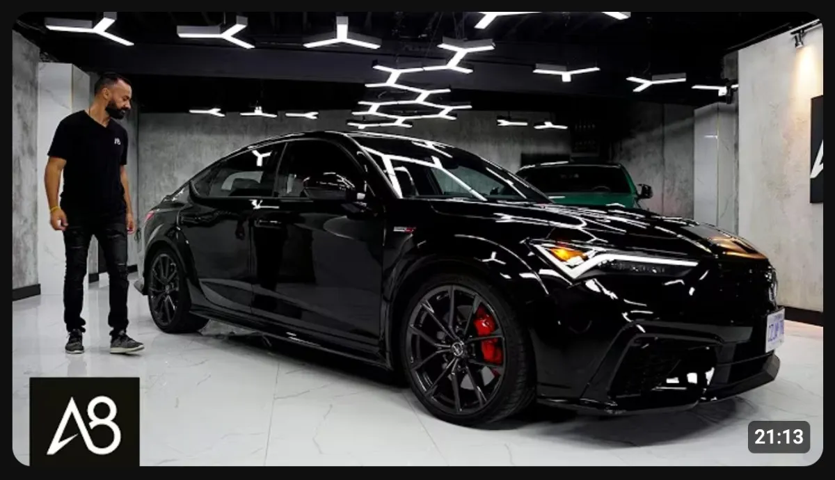
Black: Sophistication & Authority
Black can create a bold, premium look in YouTube thumbnails. It’s often paired with brighter accent colors to help important elements feel more dramatic and refined.
Represents: Sophistication, authority, and strength.
Best for: Luxury, technology, automotive, and business content.
YouTube Thumbnail Color Best Practices
The thumbnail colors you choose are important, but how you use them matters just as much. Keep these best practices in mind when designing your YouTube thumbnails.
- Use high-contrast color combinations: Colors that contrast with one another are easier to analyze and help important elements stand out. For example, white text on a blue background or a bright yellow object against a dark backdrop.
- Limit the number of colors: Using too many colors can make your thumbnail feel cluttered. In most cases, sticking to 2–4 colors will create a cleaner design.
- Stay consistent: Using a similar color palette across your thumbnails can help viewers recognize your content and strengthen your YouTube channel’s visual identity over time.
- Use color to create a focal point: Use color strategically to guide viewers to the most important part of your thumbnail. Applying a bold, distinctive color to a key element or subject can help direct attention to where you want it.
- Test different color combinations: There isn’t a one-size-fits-all approach to choosing the best thumbnail colors. Experimenting with different color combos can help you discover what resonates most with your audience.
Wrapping Up
The best YouTube thumbnail colors are the ones that align with your content and help important elements stand out.
Whether you choose the professionalism of blue, the intensity of red, or the creativity of purple, focus on using colors consistently and strategically throughout your thumbnail designs.
With the right color choices and a few best practices, you can create thumbnails that are both visually appealing and effective.
