YouTube Thumbnail Best Practices: 8 Tips to Get More Views
YouTube thumbnails are the first thing viewers notice about your videos. A well-designed thumbnail can help your content stand out and encourage more people to click.
In many cases, your thumbnail can be more important than your video title. Some creators even develop video ideas around a thumbnail concept first, knowing how thumbnails play a major role in attracting viewers.
In this article, we’ll cover the best practices for YouTube thumbnails, along with examples and tips you can apply to your own thumbnail designs.
Use the Proper YouTube Thumbnail Size
Before you start designing your thumbnail, it’s important to use the correct thumbnail dimensions recommended by YouTube.
The best YouTube thumbnail size is 1280 x 720 pixels with a 16:9 aspect ratio.
Your image should be under 2MB and saved as a JPG, PNG, or GIF file.
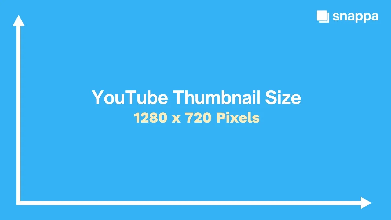
Using the right thumbnail size for YouTube will ensure your video thumbnails display properly on all devices and prevent them from appearing blurry, stretched, or cropped.
Create a Clear Focal Point
Every strong YouTube thumbnail has a clear focal point. This is the main subject, object, or design element that immediately draws attention.

When too many elements compete for attention, thumbnails can become cluttered and confusing. Instead, focus on a single subject and make it the highlight of your thumbnail design.
Common thumbnail focal points include:
- Large text
- A face or expression
- A product or object
- A unique graphic or visual element
A clear focal point will help viewers understand what your video is about and make your thumbnail easier to spot when scrolling through YouTube.
Use High-Contrast Colors
Colors that contrast with one another make text, subjects, and important design elements more noticeable. This is especially important on YouTube, where viewers see thumbnails at smaller sizes.
Using the right color combinations will improve visibility and help your thumbnail designs pop in search results and suggested videos.
For example, yellow text on a black backdrop or a dark object against a bright background image will be easier to notice than colors and shades that blend in together.
To learn more about which colors to use, check out our full guide on the best colors for YouTube thumbnails.
Keep Text Short and Easy to Read
When adding text to your thumbnails, make sure it’s large enough to see on desktop and mobile devices. Stick to 1–5 words whenever possible, and use clear, bold fonts that are easy to read at a glance.
Some of the best YouTube thumbnail fonts include:
- Aileron
- Arimo
- Cooper Hewitt
- League Spartan
The goal isn’t to explain the entire video. Instead, use text to reinforce the main idea, create curiosity, and give viewers a reason to click.
In many cases, fewer words will have a bigger impact. Keep your text concise and focus on the one message you want viewers to notice first.

Choose Images That Support the Title
Your thumbnail image and video title should complement one another. Instead of repeating the exact same information, they should each contribute something different.
For instance, if your title asks a question, your thumbnail can help visualize the answer. If your title makes a claim, your thumbnail can provide supporting context.
When thumbnails and titles work together, they create a stronger reason for viewers to watch.
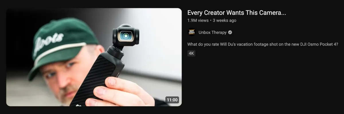
In the example above, the title creates curiosity around a camera that every creator wants, while the thumbnail image gives viewers a close-up look at the product.
Use Faces and Expressions Strategically
Faces can be an effective way to grab attention and show emotion in YouTube thumbnails. It’s one reason why many creators include themselves in their thumbnail designs.
Different facial expressions project different emotions, such as surprise, excitement, confusion, or curiosity. It’s important to choose expressions that support your video’s topic and feel authentic to your content.
When used strategically, faces and expressions can help viewers capture the tone and theme of your video before they even read the title.

Maintain a Consistent Style
Using a consistent thumbnail style will make your YouTube channel and videos more recognizable over time.
Many successful creators use similar colors, fonts, layouts, and design elements across their thumbnails.
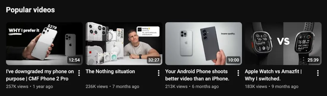
Once you find a thumbnail style that performs well, continue using it for future videos. Maintaining a consistent look will strengthen your brand and make it easier to build on what’s already working.
Test Different Thumbnail Styles
There isn’t a single thumbnail style that works for every YouTube channel. What performs well for one creator or niche may not work as well for another.
Experiment with different layouts, colors, fonts, and images to see what works for your audience.
You can use YouTube’s Test & Compare feature to test multiple thumbnail variations on a single video to see which design performs best. YouTube will compare the results and automatically select a winning thumbnail based on viewer engagement.
Pay attention to which thumbnails bring in the most views and engagement, and use those insights to improve future thumbnail designs.
Wrapping Up
Great YouTube thumbnails don’t just happen by accident.
To get better results on YouTube, follow our thumbnail best practices by using the right dimensions, creating a clear focal point, keeping text large and easy to read, and maintaining a consistent style.
There’s no perfect formula, which is why testing different thumbnail designs is so important. Continue refining your YouTube thumbnails over time, and use what you learn to create stronger thumbnail designs for future videos.
