The Biggest YouTube Thumbnail Mistakes to Avoid
It’s no secret that YouTube thumbnails play a huge role in how many views you get. But even the smallest mistakes can make your thumbnails less noticeable and lead to fewer clicks.
Fortunately, most thumbnail mistakes are easy to fix. Making a few simple changes can help improve readability, attract more attention, and encourage viewers to click.
In this guide, we’ll cover the most common YouTube thumbnail mistakes and how to avoid them.
Mistake #1: Using the Wrong Thumbnail Size
One of the most common thumbnail mistakes is using the wrong image dimensions.
If your thumbnail is too small or doesn’t use the correct aspect ratio, it can appear blurry, stretched, or cropped on YouTube.
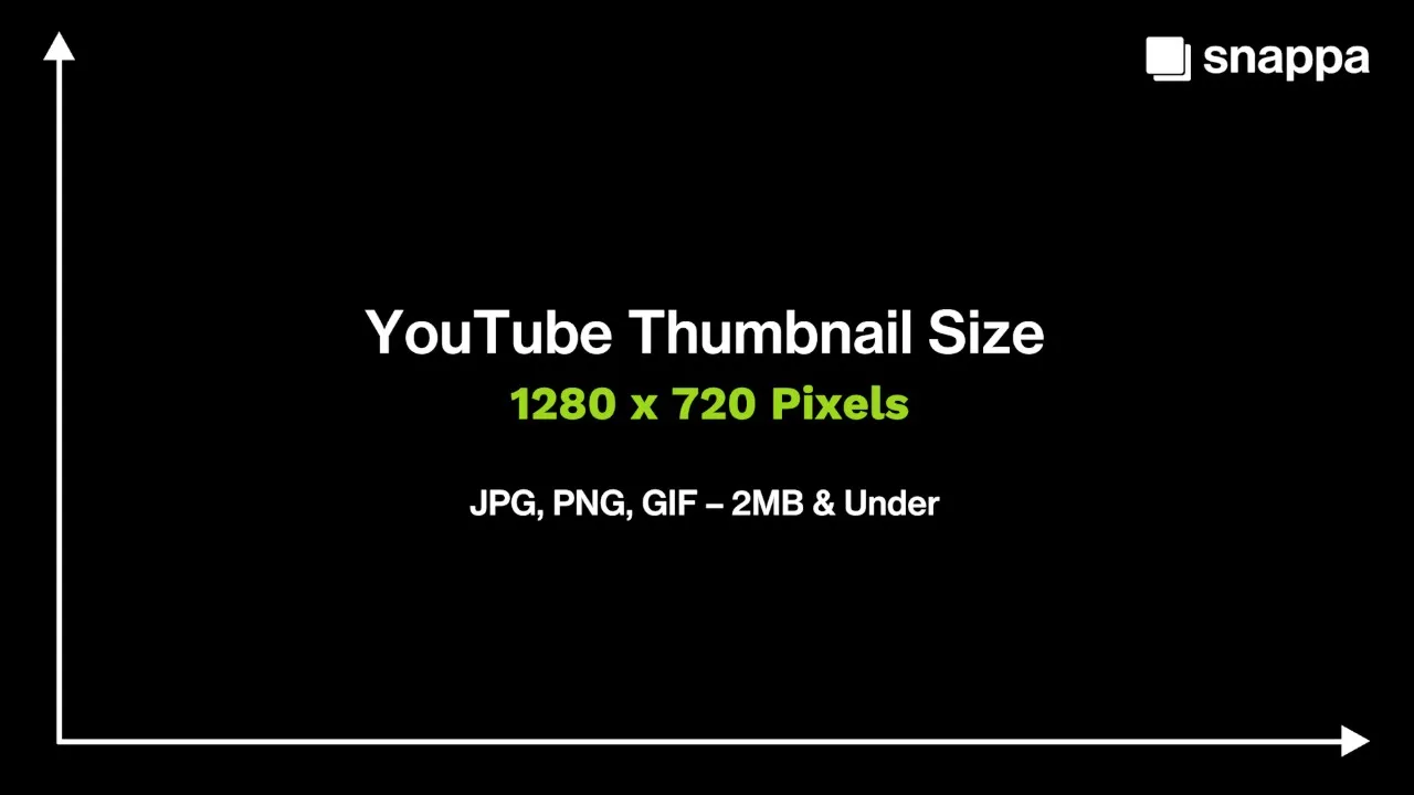
The best YouTube thumbnail size is 1280 x 720 pixels with a 16:9 aspect ratio. Your thumbnail image should be a JPG, PNG, or GIF file that is under 2MB.
Mistake #2: Using Text That’s Too Small
Small text can be difficult to read, especially on mobile devices.
If viewers can’t quickly read your thumbnail text, they’re more likely to keep scrolling.
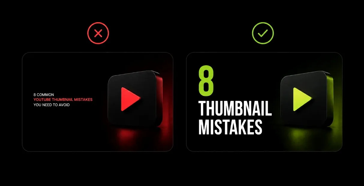
Keep your text large, bold, and easy to read at a glance. You should limit your text to 1–5 words when possible, as shorter text is easier to process and leaves more room for your visuals.
Mistake #3: Choosing the Wrong Font
The thumbnail font you use can have a big impact on readability and your click-through rate.
Thin, decorative, and handwritten fonts may look great up close, but they can become difficult to read at smaller sizes.
Clean sans-serif fonts are often the top choice for thumbnails because they’re designed for readability and work well across a wide range of content.
Some of the best thumbnail fonts to use are:
- Aileron
- Arimo
- Cooper Hewitt
- League Spartan
Want more font recommendations? Check out our full list of the best YouTube thumbnail fonts to use.
Mistake #4: Placing Important Elements in the Wrong Spot
The placement of text, images, and design elements in your thumbnail plays an important role in its overall effectiveness. Poor placement can leave key details partially hidden and harder to notice.
Avoid placing text or subjects in the bottom-right corner of your thumbnail, as YouTube’s video timestamp can cover them.
Instead, keep your most important elements near the center or upper-left portion of your thumbnail, where they’re more likely to be seen.
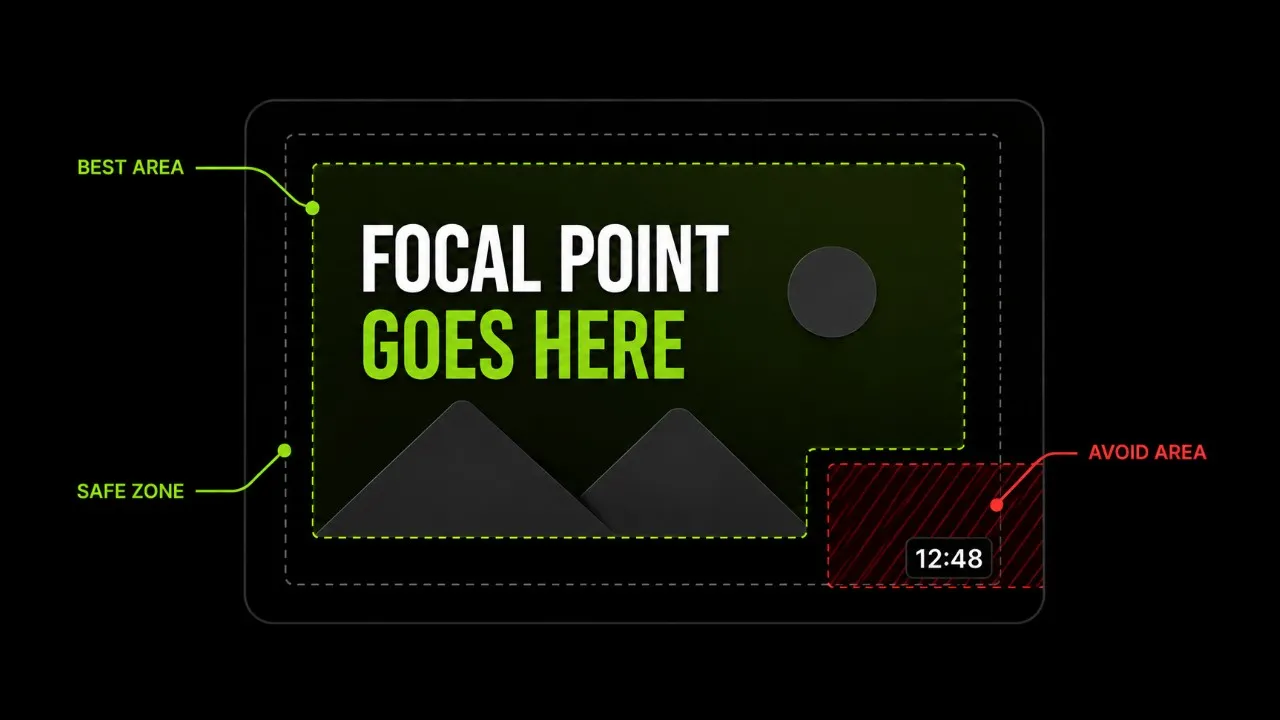
Before uploading your thumbnail to YouTube, zoom out and view it at a smaller size to make sure your key design elements are visible.
Mistake #5: Having No Clear Focal Point
When viewers scroll through YouTube, they should be able to quickly identify the main focus of your thumbnail.
If too many subjects, images, or design elements compete for attention, it can be difficult to know where to look.
Choose one or two main focal points and make them the most prominent parts of your thumbnail. This could be faces, products, objects, text, or elements that help communicate what your video is about.
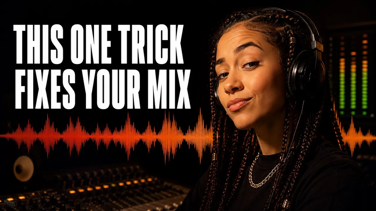
Keeping the focus on one or two main elements makes your thumbnail easier to process and helps your message come across more clearly.
Mistake #6: Using Low-Quality Images
Low-quality images can make strong thumbnail layouts look unprofessional.
Blurry, pixelated, or poorly sized images will make it harder for viewers to understand what they’re looking at.
This often happens when creators pull screenshots directly from their videos. Depending on the frame, the screenshot may contain motion blur, poor lighting, or a low-resolution image.
When using a screenshot, choose a clear frame where the main subject is in focus. It’s always best to use high-resolution photos and graphics to keep your thumbnail looking crisp across all devices.
Need help finding high-quality images to use in your thumbnails? Check out our guide on the best free stock photo sites to use.
Mistake #7: Ignoring a Consistent Thumbnail Style
Many creators make the mistake of designing every thumbnail differently.
While it’s fine to experiment, constantly changing your colors, fonts, and layouts can make your channel harder to recognize.
Once you find a thumbnail style that performs well, stick with it.
Using a consistent design layout across your thumbnails will help strengthen your brand and make your content easier to recognize on YouTube.
Mistake #8: Using a Thumbnail & Title That Don’t Work Together
Your thumbnail and video title are often the first two things viewers notice, so they should work together to give people a reason to click.
A common mistake is using the exact same message in both.
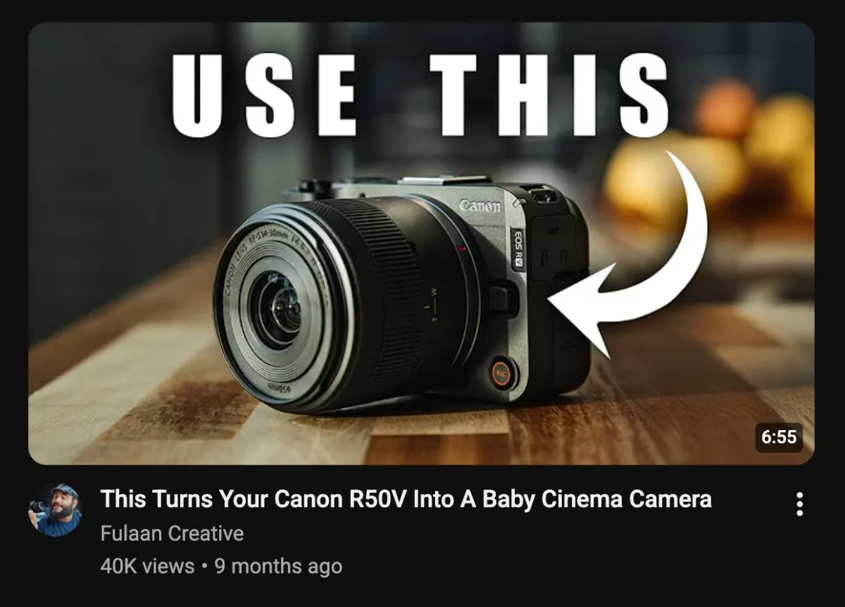
Instead of repeating your title in the thumbnail, use each one to provide a different piece of information about the video.
For example, your title can introduce an interesting question, feature, or statement, while your thumbnail can add context or create curiosity.
When your thumbnail and title work together, they make your video more compelling to click.
Wrapping Up
Small thumbnail mistakes can make it harder for your videos to attract attention and get views. The good news is that most of these mistakes are easy to fix.
Here are the key takeaways to remember:
- Use the correct YouTube thumbnail size.
- Keep text large, clear, and easy to read.
- Choose high-quality images with a clear focal point.
- Place key design elements where they won’t be covered.
- Make sure your thumbnail and title work together.
Use this guide as a checklist when creating your next thumbnail design, and you’ll have a much better chance at getting viewers to click.
